

The World Map As You Know It Is Misleading – Now Africa Wants To Change That
The World Map You Know Is A Lie – And Africa Wants To Redraw It
The map of the world as you know it – the Mercator projection – isn’t totally accurate. And Africa is leading the charge to get rid of it for good.
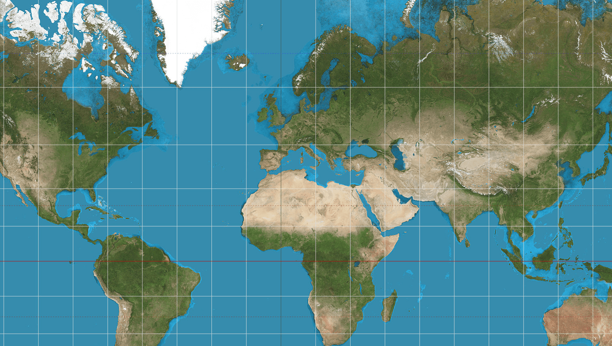
The rest of this article is behind a paywall. Please sign in or subscribe to access the full content. Last week, the African Union, a continental union of 55 member states, reportedly endorsed a campaign to have organizations around the world replace the Mercator map with an alternative map that more accurately reflects the size of Africa. The effort is also being championed by the Caribbean Community, an intergovernmental group of 15 member states. The Mercator projection was created by the Flemish cartographer Gerardus Mercator back in 1569. It's a cylindrical map projection, in which you place the globe into a cylinder and then project each point of the map onto a corresponding point on the cylinder. Over the following centuries, amidst the Age of Discovery and the Enlightenment, it became the go-to map for navigating oceans and crossing continents. Even today, it’s still widely used in school classrooms, textbooks, media reports, and the like. It was even the basis of Google Maps (although the program now presents Earth as a digital globe, leaving behind the distortions of flat maps). And here lies the problem: it’s very tricky to portray a three-dimensional spherical object, like planet Earth, on a two-dimensional plane, like a flat map. Something’s got to give. Compromises have to be made. To work around this geometrical difficulty, the Mercator projection distorts the sizes of landmasses: regions near the poles appear larger, while areas near the equator are shrunk. As a result, North America and Europe look far more imposing than they actually are, while Africa and regions near the equator seem much smaller. For instance, the Mercator projection makes Greenland appear bigger than Africa, even though in reality, Africa is a staggering 14 times larger. Many people in Africa, now including the African Union, believe this is grossly unfair. There’s a growing movement within the continent and its modern diaspora that argues the Mercator projection needs to be replaced with an alternative map, like the Equal Earth projection, developed in 2018. Advocates believe that this is more than just a matter of cartographical accuracy. The Mercator map, they argue, inflates North America and Europe while shrinking Africa, reinforcing a Western-centric view of the world that sidelines the continent and downplays its global significance. “Africa is misrepresented on the world maps, and it’s not just a matter of geography — it’s a reflection of how the world views the continent,” Correct The Map, an Africa-based campaign that wants organisations like the United Nations to adopt the Equal Earth map, said in a statement. Is that fairer? Equal Earth projection, created by Geocart map software. “By correcting the map, we aim to shift perceptions and highlight the true scale, power, and potential of the African continent. Accurate map projections are vital not only for education and geography but also for fostering a deeper understanding of Africa's role in the global community," it says. "This campaign is about more than just changing a map. It's about giving Africa the visibility and respect it deserves." However, no two-dimensional map of the planet will be perfect. Critics argue that the Equal Earth, as well as any other alternative map models, make compromises just like the Mercator projection; it is simply making those trade-offs elsewhere. While it is better at accurately showing surface area, the map can distort the shape of some regions. As ever, the best way to understand the layout of Earth’s landmasses and oceans is by looking at a globe, whether it's a digital incarnation or a spinning physical orb in an old library. Failing that, you can always check out this interactive map that reveals the “true” size of countries compared to their depiction on the Mercator projection.
