

13 Off-White Paint Colors That Experts Always Recommend to Make Rooms Feel Bigger and Brighter
13 Off-White Paint Colors That Make Any Room Feel Bigger and Brighter
An off-white paint color effortlessly combines warmth and brightness, offering a clean backdrop that's soft and inviting without appearing stark. These neutral shades vary widely—some have warm undertones, leaning toward taupe or pink, especially when paired with white trim. Others carry green and gray undertones, complementing cool color palettes. Versatile and timeless, off-white paint colors adapt to any style, making rooms feel more spacious and comforting. "Off-white never goes out of style," says Ashley McCollum, Glidden paint color expert.
To choose just the right off-white paint color for your space, we asked paint industry experts to tell us their go-to shades.
Alabaster by Sherwin-Williams
Courtesy of Sherwin-Williams
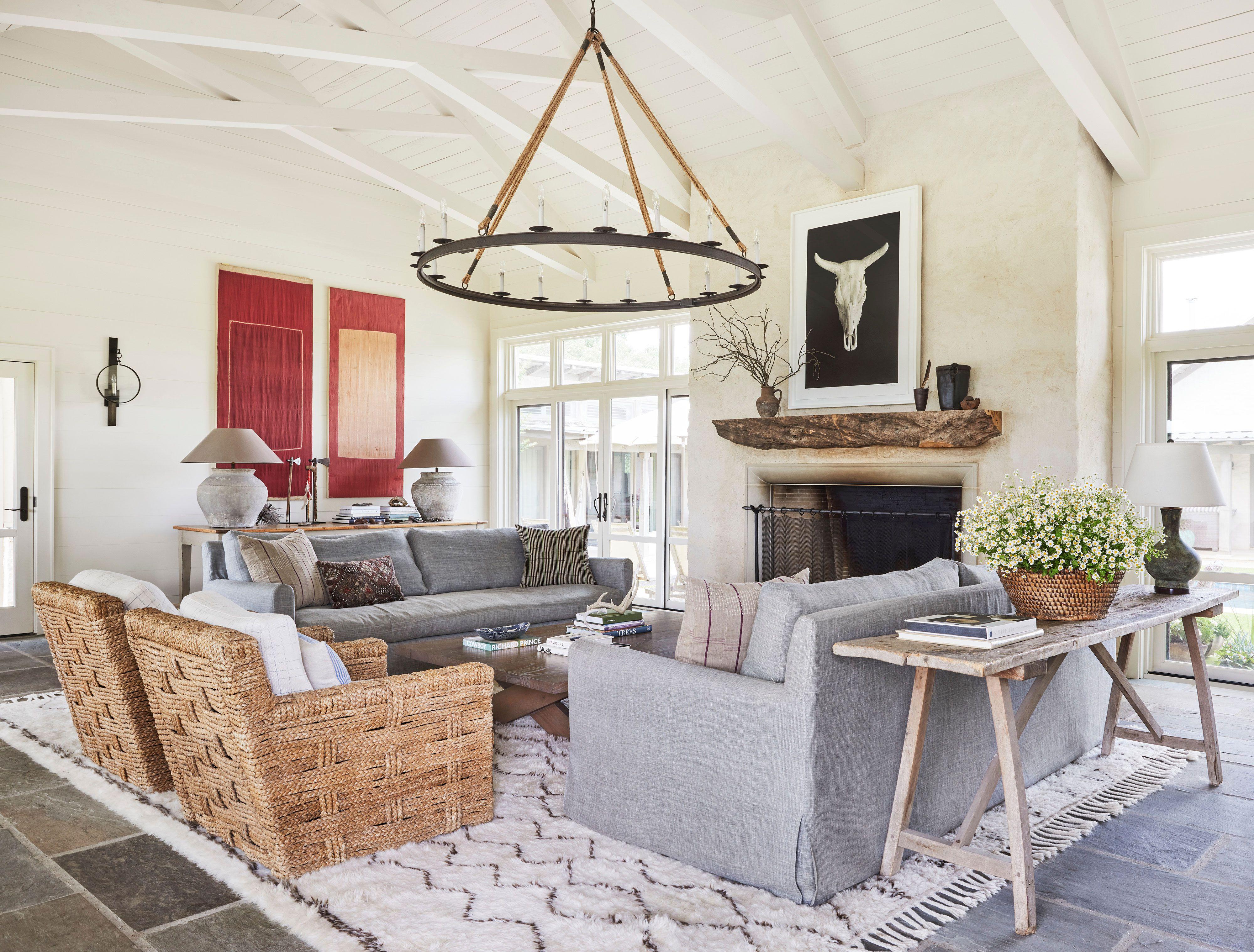
Alabaster is a classic choice from Sherwin-Williams, favored for its perfect mix of brightness and warmth. This popular off-white shade helps create a cozy, inviting space. "It perfectly balances the brightness that many homeowners want in a white with the warmth to create a cozy and inviting space," says Emily Kantz, color marketing manager at Sherwin-Williams. This versatile color works wonderfully on walls throughout the home, offering a fresh yet inviting backdrop for any decor style.
Paint color: Alabaster by Sherwin-Williams
Whipped Cream by Behr
Courtesy of BEHR
For a delicate off-white that suits natural color schemes, consider Whipped Cream. "It's a delicious off-white tone that’s the perfect blend of light and airy with a grounding undertone," says Cara Newhart, interior designer and Behr ambassador. This versatile shade is ideal for walls and cabinetry. "With a warm slightly green undertone, this shade helps ground natural color palettes and pairs well with blues and other colors with golden undertones," she says.
Paint color: Whipped Cream by Behr
Focus by Glidden
Courtesy of Glidden
Focus is a warm, creamy, classic off-white paint color. "Its subtle undertones and fresh appearance give it a timeless quality, ensuring versatility and longevity in your space," McCollum says. It offers a gentle and relaxed atmosphere, complementing neutrals like greige, tan, and gray beautifully. For an accent, consider introducing a deep blue shade to provide a soothing contrast.
Paint color: Focus by Glidden
Simplified White by Dutch Boy Paints
Courtesy of Dutch Boy Paints
“Simplified White is a versatile and elegant off-white, making it perfect for both contemporary and traditional spaces," says Lisbeth Parada, interior designer and color marketing manager at Dutch Boy Paints. It’s clean and understated, establishing a lovely backdrop for cool-toned shades. "Its subtle warmth helps create a soft, welcoming atmosphere while maintaining a modern aesthetic," Parada says. This shade is ideal for open floor plans, hallways, and kitchens where a fresh, neutral backdrop is desired.
Paint color: Simplified White by Dutch Boy Paints
Blank Canvas by Behr
Courtesy of BEHR
Blank Canvas is one of the most popular off-white paint colors out there and Newhart describes it has her go-to off-white shade. "It’s light and bright with a creamy undertone to help it feel welcoming and not too stark," she says. It works with any color palette, whether warm or cool, and Newhart shares she also loves using this shade for trim work.
Paint color: Blank Canvas by Behr
Horizon by Benjamin Moore
Courtesy of Benjamin Moore
Benjamin Moore's Horizon is a sophisticated off-white hue that sets a serene and refreshing tone thanks to its delicate blue and gray undertones. "This subtle yet impactful shade serves as a blank canvas, inviting you to infuse your unique style and personality into the room," Yeo says. The pale shade is a timeless choice for any space ,and Yeo adds, "Whether you’re showcasing artwork or adding decorative accents, this hue effortlessly complements a variety of design elements."
Paint color: Horizon by Benjamin Moore
Wevet by Farrow & Ball
Courtesy of Farrow and Ball
For a translucent, barely there shade of off-white, opt for Wevet by Farrow & Ball. "Wevet contains minimal color, like the spider webs it is named after," says Joa Studholme, color curator at Farrow & Ball. This soft off-white paint color is clean, understated, and easy to pair with other colors. "A white with the merest tinge of grey, it is delicate and hushed in tone, but feels clean and modern in most spaces," Studholme says.
Paint color: Wevet by Farrow & Ball
Ultra White by Dutch Boy Paints
Courtesy of Dutch Boy Paints
“Ultra White is a bright, clean off-white that works exceptionally well in contemporary spaces," Parada says. It creates a beautiful all-over wall color, and because it reflects light well, it makes rooms feel larger and more spacious. "This color pairs wonderfully with modern decor or bold accent pieces, creating a contrast while keeping the overall space fresh and airy," she says.
Paint color: Ultra White by Dutch Boy Paints
Oyster White by Sherwin-Williams
Courtesy of Sherwin-Williams
Create a soft and calming backdrop with Oyster White by Sherwin-Williams. It has a slight green-beige undertone which makes it simultaneously stylish and serene, and it looks especially beautiful when layered with natural finishes or dramatic pops of color. "It's a great off-white for those looking to achieve quiet luxury sophistication in their space," Kantz says.
Paint color: Oyster White by Sherwin-Williams
Dimity by Farrow & Ball
Courtesy of Farrow and Ball
"Dimity has the most compelling warm undertones," Studholme says. It's a chameleon of a paint color that leans towards taupe or pink based on what you pair it with. "It could be considered a very pale taupe when combined with white trim," she says. To achieve a more pink tone, layer it with Farrow & Ball's All White and Pointing. Studholme says it's also her go-to complementary white for earthy warm tones on the wall.
Paint color: Dimity by Farrow & Ball
Blank Canvas by Glidden
Courtesy of Glidden
Glidden's Blank Canvas works well as an all-over wall color when paired with other warm neutrals, such as beiges and tans. "It has a warmer undertone which creates a cozy and welcoming atmosphere to any home," McCollum says. It's a beautifully balanced off-white hue that leans toward beige, especially when complemented by natural woods through flooring, decor, and furniture. Brighten the space with crisp white trim and accents for an updated feel.
Paint color: Blank Canvas by Glidden