

WWW.THECOLLECTOR.COM
The Strange History of Why North Is Always Up
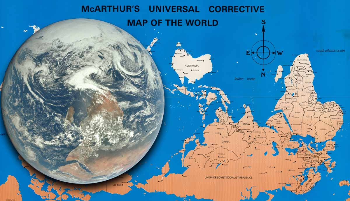
For centuries, world maps have been designed under a widely accepted spatial convention: the north goes up, and the south goes down. With this perspective largely uncontested, imagining other ways of representing the world might seem irrational or even unscientific. Yet, unquestionable trust in how the world is taught is a barrier to understanding that the purportedly objective activity of map-making has long been influenced by different historical and cultural conjunctures and undertaken for specific geopolitical purposes.Cartography: A Crash CourseMedieval map of Europe represented as a queen or Europa Regina by Sebastian Mnster. 1570. Source: The NewberryMaps are visual resources that help people locate places in the world. However, they also shape the way humans perceive, imagine, and understand the spaces they inhabit and how people from other places are viewed. The history of cartography demonstrates how different geographical representations have centered the maps artist and his or her place, culture, and society. Behind the illustrators hand, a whole worldview, socially, culturally, and historically situated, is being represented and is often presented as an objective truth. This reflection becomes relevant when considering that the worlds cartographical representation is perceived as universal and scientifically objective when, in fact, it often serves to legitimize a far more narrow perspective.The north and south have never been represented in the same way in all places of the world. For instance, 17th-century Turks would draw maps illustrating the extension of the world known to them, putting the Middle East at the center of the map; 19th-century Koreans would do similarly, placing what is now China at the center. Christians of the 15th century featured Jerusalem as the central area of their cartographies. By situating the map maker at the center, maps have also been subject to practices of othering, of pushing foreigners and undesirable places to the peripheries. Cartography has also been used as a tool for colonial expansion or symbolic ethnic erasure, as happened with different settlers and colonial powers who imposed new names over indigenous places while claiming them as part of their territories.More recent examples of how politics and history influence the objectivity of maps include contemporary Arab maps where Palestine appears as a recognized state in contrast with Israeli maps or Hungarian maps, including the Romanian region of Transylvania as part of their country. Maps are, then, far from being purely objective; they are tools for exercising power, cultural affirmation, and dominance and for creating barriers between nations and communities.Map of the British Empire by Walter Crane, 1886. Source: Cornell University LibraryAnother important point to consider in questioning maps often unchallenged objectivity is the way in which cartographic projections have been tremendously distorted and sometimes problematic. Throughout history, different approximations have been made to respond to a great challenge: representing the worlds spherical shape on a flat surface. Although several attempts have been made and are currently being tested, the most used projection today is the one made by Gerardus Mercator in 1569more than four centuries ago! It became widely used for navigation as it represented the north up and south down while maintaining accurate shapes of landmasses and water bodies.Mercators projection was eventually accepted worldwide, marginalizing other representations as inaccurate. However, one problem with this representation is that smaller areas near the poles are enlarged in comparison to the areas located closer to the Equator. For instance, Greenland appears to be larger than the entire African continent, which in reality is 14 times larger than Greenland. This Northern bias creates the illusion that countries in the north are larger than those in the south. Furthermore, studies have shown this misrepresentation has psychological impacts on how space is perceived in terms of positive or negative reactions, leading to spatial biases wherein the North is associated with more privilege or well-being. In todays geopolitics, the term Global South refers to impoverished countries with lower rates of economic development, while the Global North includes the most privileged and rich countries in Europe and North America.Reimagining Maps: South Can Be UpPhoto of Al-Idrisis world map in a 1456 copy of the book Al ibn Hasan al-Hf al-Qsims. Original edition published in 1154. Source: The Ohio State UniversityFirst and foremost, its important to recognize that encountering an inverted map of the world can be a truly confusing, intimidating, and uncomfortable experience because what has been normalized and naturalized suddenly becomes challenged and destabilized. However, this upending of norms is also an opportunity to see the world with fresh eyes, as if for the first time. When viewing an inverted representation of the world, the reorientation can be quite striking: South America, Africa, and Australia gain geographical relevance because they seem bigger, while Europe becomes smaller and almost unnoticeable compared with other regions in the world. South America becomes East of North America, and most of the African continent appears to be in the northern hemisphere, rather than southern.There is no strong scientific argument for aligning the north of a map with the magnetic north pole of the Earth; whatever the orientation of the map is does not affect the accuracy of measurements or spatial relations between places. An interesting anecdote illustrating this truth was the first-ever photo of Earth, taken by the Apollo 17 crew in 1972, which they called the Blue Marble. Although now the photo is commonly edited to fix it to fit standard cartographic conventions, with the south pointing downward, the original photo depicted the southern tip of Africa pointing upwards, revealing the absence of orientation conventions in space.Original photo of Earth from Apollo 17, 1972. Source: Lunar and Planetary InstituteThe orientation used today to understand what is where in the world has never been universal. Consider 12th-century maps in an Arabic-language book, The Excursion of the One Who Yearns to Penetrate the Horizons, more commonly as Tabula Rogeriana, in which parts of Africa, Asia, and Europe have their southern points oriented to the upper part of the sheets. This cartographic project was commissioned by Norman King Roger III of Sicily to Arab geographer Muhammad al-Idrisi in 1154. Al-Idrisis map of the Mediterranean Sea shows Mecca in the center, Europe to the south, and the Arabic Peninsula to the north. This map is also considered one of the most accurate representations of the world at that time.South-up Maps and DecolonizationThe Tabula Rogeriana, or The One Who is Eager to Traverse the Regions of the World by Muhammad al-Idrisi and reconstructed by German scholar Konrad Miller, 1154. Source: National GeographicSouth-up map orientations are often utilized as a political stance against the domination of practices that originated in the Western/European world and expanded throughout the globe through colonial domination. The Mercator projection has been shown to have influenced an inaccurate image of the world that perpetuates colonial mindsets and social hierarchies. These imaginaries still play an important role in todays geopolitics and social apparatuses of exclusion and segregation, sometimes leading to xenophobia, racism, or pity for underdeveloped countries in the Global South.In the Latin American context, it has become more common to find south-up maps of South America and the Caribbean islands in social and political movements aligned with postcolonial, decolonial, or feminist agendas. What they are calling for is a critical review of the Western and Eurocentric modes of knowledge that have been taught as unidimensional realities, and that have preserved the symbolic and material dominance of Northern countries over those located elsewhere.The first person to promote the use of inverted maps of Latin America was Uruguayan artist Joaqun Torres-Garca in his work South Americas Inverted Map (1943). By drawing an inverted map of South America, he highlighted the importance of directing attention towards South American traditions instead of looking at European and North American cultures and societies as more significant, powerful, and even exemplary. Almost a decade earlier, Torres-Garca published a manifesto called The School of the South (1935), where he proposes a symbolic and political shift between center/periphery and upper/lower models to revindicate indigenous knowledge from the South. Torres-Garca proposes that instead of thinking of the Worlds North as our North, it should be the Southour pole.Drawing Amrica Invertida (Inverted America) by Uruguayan artist Joaqun Torres-Garca, 1943. Source: Smart HistoryFurthermore, as part of the strategy to revindicate historically silenced and dismissed local Indigenous knowledge and experiences, the use of inverted maps has found even more relevance. One example is the way some Latin American feminist and indigenous movements use an inverted map to represent what they often call the Abya Yala, an indigenous word used to refer to the American territories, challenging the colonial legacy of the name Latin America: the first part of the name referring to colonizers roots in Roman/Latin culture, and the second, America supporting the notion that America was discovered by Italian explorer Amerigo Vespucci.Another example of how inverted maps have been used for revindicatory purposes is Stuart McArthurs Universal Corrective Map of the World, created in 1979. McArthur developed his idea of an upside world as a response to seeing his country, Australia, always at the corner of the world. He drew the first inverted map of the world when he was 12 and was bullied by US student colleagues in Japan because he was coming from the bottom of the world.South-up vs. North-up: Which Map is Correct?McArthurs Corrective Map of the World, 1979. Source: Barry Lawrence Ruderman Antique Maps Inc.There is no correct answer to this question, just a multitude of historical, geographical and geopolitical nuances to consider. However, revisiting the very rooted assumptions of how humans understand the world is an important step to understanding how history, and more specifically, the history of cartography, has pushed many voices aside and legitimized a quite exclusive vision of the world that has served the interests of a few. Whether viewing inverted maps invokes discomfort or inspiration, what has become an important reality today is that south-up maps offer a firm critique of Eurocentric and Western knowledge and are being used as a symbolic strategy to recenter and relocate what is considered important, recognizing those who in earlier times were pushed to the peripheries of knowledge, power, and existence.Bibliography:De Armendi, N. (2009). The map as political agent: destabilising the North-South model and redefining identity in twentieth-century Latin American art. North Street Review: Arts and Visual Culture, 13, 5-17.ICA Commission of Map Design. (2014). MapCarte 38/365: McArthurs Universal Corrective Map of the World, Stuart McArthur, 1979. Retrieved from https://mapdesign.icaci.org/2014/02/mapcarte-38365-mcarthurs-universal-corrective-map-of-the-world-stuart-mcarthur-1979/ on June 10, 2024.Meier, B. P., Moller, A. C., Chen, J. J., & Riemer-Peltz, M. (2011). Spatial Metaphor and Real Estate: NorthSouth Location Biases Housing Preference. Social Psychological and Personality Science, 2(5), 547-553. https://doi.org/10.1177/1948550611401042
0 Commentarii
0 Distribuiri
179 Views