

Our homes are often our sanctuaries—a place where we can reset after a long, chaotic day. But as we live, work, play, and relax in our personal spaces, how can we design them to feel as comfortable as possible?
While soft furnishings, calming art, and natural light all play key roles in creating a soothing space, we don’t always recognize just how much design weight our walls carry too. After all, walls tend to take up the most visible square footage in any space (ceilings count, too— they're technically the fifth wall). But make the wrong design move here, and this very element can instantly throw off the entire look and feel of your space.
That's why sensory-friendly wall design is having a major moment right now–it's a strategic way reclaim a sense of rest in your space. But does it actually work? Read on to learn what our experts say, including the best sensory-friendly design tips and techniques to create walls that won't overstimulate you.
1. Design with Your Ultimate Goal in Mind
As you get started, should you focus on the desired feeling—like calm or energy—or map out your color palette first? "When it comes to design, begin with the end in mind. Instead of choosing the color first, focus on the sensory objection that you are designing around," says design expert Lee Crowder.
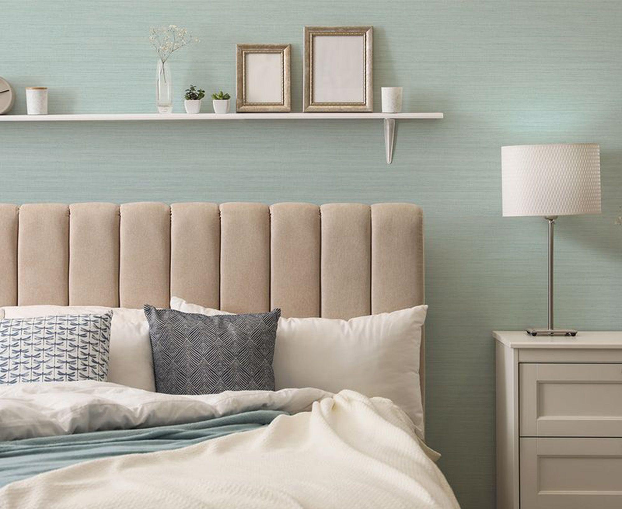
For example, if your goal is to create a space that captures the essence of the beach—with calming ocean hues and coastal textures—choose your wallcovering or color to reinforce that atmosphere. Reach for soft shades of blue, sun-bleached neutrals, or natural materials like rattan, sisal, or jute to create a sense of ease and airiness.
2. Use Easy Textures and Patterns
There are some patterns and textures that work better in sensory-friendly designs. Amanda Both, design director for Tempaper & Co., suggests designing for the way you want the space to feel. "In high-traffic spaces like bedrooms or family rooms, larger-scale patterns tend to feel more calming and less visually overwhelming, while smaller, busier patterns can energize a space," she says.
Minimizing glare, sound reflection, or any tactile discomfort can also help create a more sensory-friendly space. Both says textured wallpaper is especially effective. "Matte and tactile finishes help minimize glare and offer a soft, comforting visual experience," she says. "Raised faux textures like linen and grasscloth can also subtly diffuse sound and create a more serene environment—ideal for bedrooms, therapy rooms, or any calming space."
Related
3. Consider Color Basics
Since creating a sensory-friendly space—especially through color—can be a subjective experience, it can help to consider color theory basics. Knowing elements like hue, value, chroma, and whether a color is warm or cool can all guide you towards picking hues that feel good in your space. And while blues and greens are often considered calming, how you perceive a color can vary widely based on your personal associations.
That’s why, when it comes to sensory-friendly design, it’s not just about choosing a universally 'soothing' color, it’s about finding the one that feels right to you.
Crowder also cautions against using high contrast colors. "Instead, embrace soft color combinations like a muted white paired with a light pastel color," she says. "To keep it simple, you can even incorporate combinations of the same color [also known as a monochromatic color scheme]."
4. Explore the Right Color Strategy
Pinning down a color strategy can help too, but it’s often trickier than choosing the right texture. Since several factors influence how we perceive color—age, lighting, color psychology, and even surrounding materials—what looks like 'sky blue' to one person might read differently to another.
But, there are some foolproof ways to choose a sensory-friendly paint color. To start, control how much color you inject into your space, and where you place it. You can also thoughtfully curate a color palette that's more gentle on your senses.
Wallcovering expert Iona Graham says that while everyone has their own sensory preferences, blue hues are generally a good choice to foster concentration and calm—perfect for home offices, libraries, or studies. Green is also a soothing color that is easy on the eyes and works especially well for bedrooms, she says.
In general, Graham says soft muted tones like sage green or pastels work best, as these shades are calming and can create a serene atmosphere. But, location plays a role too. For example, if you're looking to design a space conducive for socializing, like a dining room, rich browns may be a better fit, Graham explains.
5. Prioritize All Senses, Not Just What You See
If you or someone in your home is sensitive to light, sound, or touch, there are other considerations beyond just aesthetics. "Choosing the right design elements, like colors and materials, creates an environment that’s easy to relax or to focus in. For many individuals, touch is a key sense that supports self-regulation," says Jennifer Daltorio, wallcovering expert. " A diverse range of textures can help individuals soothe their systems and ground themselves. Modern wallcoverings have fantastic tactile qualities."
For example, "Designs with raised inks or embossed vinyl wallpaper have a pleasant, ridged texture. Some textile wallcoverings also feature a variety of weaves and soft fabric finishes," she says. "For truly luxurious plushness, woolen or string [wallcoverings can be an ideal sensory-friendly option].”
Daltorio says wallpaper even offers a solution for auditory overstimulation. "Acoustical wallcoverings absorb sound, improve auditory balance, and reduce echo within a space,” she says. “This is a tremendous asset for people who can become overwhelmed by loud or too much noise.”
"Decorating is arguably the best part of making a home. For individuals with sensory needs, however, decor goes beyond what’s beautiful and becomes a tool for improving mental health. We often talk about wallpaper bringing visual comfort to a space, but in some cases, the comfort it provides is much more literal," Daltorio says.