

Imagine a craftsman pressing a copper chisel into pale limestone somewhere near Saqqara, around 2600 BCE. He is not simply decorating a wall. He is making decisions about shape, spacing, proportion, and hierarchy — decisions so deliberate, so systematic, that a type designer at a modern studio would recognize every one of them instantly.
The Typographic Problem Egypt Solved First

Most people, when they hear the word “typography,” picture Gutenberg’s press, ink-black letters stamped onto vellum in a Mainz workshop sometime around 1440 CE. That image is not wrong, but it is catastrophically late. Egypt’s hieroglyphic writing system was already fully systematized by at least 3200 BCE — a gap of roughly 4,700 years separating the two moments.
Gutenberg solved a problem of reproduction. The Egyptians solved a far harder problem first: how to turn human thought into a stable, repeatable, visually coherent system of marks. That is typography at its root. And the evidence for it is cut into thousands of surviving limestone walls, painted across countless sheets of papyrus, and now encoded — all 1,079 glyphs of it — inside a free digital font you can download today.
The reframe matters because it changes the entire story of written communication. The history of typography is not a story that begins in medieval Germany. It begins in the Nile Valley, in the pre-dynastic mud and ivory of a culture that was already ancient when Rome was a marsh.
Hieroglyphs: How the World’s First Visual Writing System Was Born

The earliest confirmed evidence of Egyptian writing comes from Abydos, the ancient burial ground of Egypt’s first rulers, where archaeologists recovered small ivory and bone tags bearing pictographic marks dated to roughly 3400-3200 BCE. These were not random scratches. They carried phonetic values — sounds, not just pictures — which is the threshold that separates true writing from decorative symbol-making. Egypt crossed that threshold and kept running.
What emerged was not a single script but an entire typographic family: three related styles adapted to three different surfaces and purposes. Monumental hieroglyphs — the elaborate, detailed signs carved into temple walls and royal tombs — functioned as display type, the ancient equivalent of a headline cut in stone. Hieratic, a flowing cursive developed for writing on papyrus with a reed pen, was the workaday text face, optimized for speed and legibility at smaller scales. Demotic, which appeared later still, compressed the forms further, prioritizing efficiency over ornament.
Egypt, in other words, developed the concept of a type family — the same underlying letter system rendered in different styles for different contexts — roughly five millennia before font designers gave the practice a name.
Scholars recognize the Egyptian script as one of the genuinely independent origins of writing in human history, alongside Sumerian cuneiform in Mesopotamia. That independence matters because it means the design choices embedded in Egyptian hieroglyphs — the proportions, the grouping logic, the use of negative space — were not borrowed from anyone. They were original solutions to the universal problem of making meaning visible.
Those solutions were sophisticated. Egyptian scribes paid close attention to what modern typographers call baseline alignment, the invisible horizontal line on which letters sit to create visual stability. They were equally attentive to the relationship between a sign and the empty space surrounding it, understanding that legibility depends as much on what is not drawn as on what is. These are not primitive instincts. They are the core concerns of professional type design, alive and active in Egypt more than five thousand years ago.
The Ancient Egyptian Alphabet Hidden Inside the Hieroglyphs

Here is a fact that surprises almost everyone: ancient Egypt developed, embedded within its larger hieroglyphic system, a set of twenty-four unilateral signs — one sign for each consonantal sound the language used. Linguists call these uniconsonantal signs, but what they are in functional terms is an ancient Egyptian alphabet. Egypt never chose to use those twenty-four signs alone as a complete writing system — the fuller hieroglyphic system was too culturally embedded, too rich in symbolic resonance — but the alphabet was there, fully formed.
Those twenty-four signs are the direct ancestors of the Phoenician alphabet. Phoenician merchants, trading along the eastern Mediterranean coast around 1050 BCE, stripped the Egyptian consonantal signs down to their essential phonetic function, discarding the pictorial complexity and keeping only the sound-shapes. The Greeks inherited the Phoenician system around 800 BCE and made one transformative addition: vowels, symbols for sounds the Phoenicians had left to context. From Greek, the forms passed to Etruscan stonecutters, and from Etruscan to Roman, where they were refined into the elegant capitals that became the backbone of Western letterforms.
Every time you read a headline set in Times New Roman or a logo rendered in a bold sans-serif, you are looking at a design lineage that runs in an unbroken thread back to a limestone wall in the Nile Valley. The shapes have been compressed, abstracted, and digitized almost beyond recognition, but the ancestry is real. The letter A, rotated, still carries the structural memory of the Egyptian ox-head sign that gave it its consonantal value.
Scribes in ancient Egypt made choices about which signs to deploy based on context, audience, and surface — formal religious texts received one treatment, administrative records another, private letters a third. That is a decision tree remarkably close to what a modern designer navigates when choosing between a serif face for long-form reading and a sans-serif for a screen interface. The problems are the same. The medium has changed. The thinking has not.
Egypt’s Design Rules: Typography Before the Word Existed

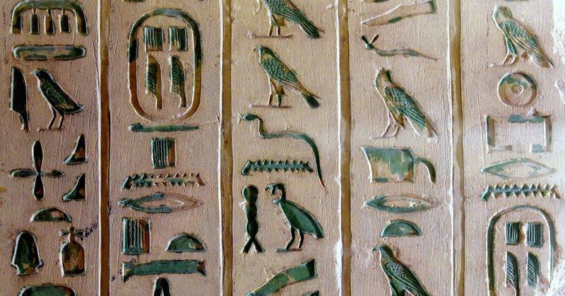
Egyptian monumental inscriptions were not laid out freehand. They followed a grid. Individual glyphs were grouped into rectangular units that Egyptologists call quadrats — essentially square compositional cells in which two or three smaller signs were arranged to balance visual weight and fill the space evenly. The quadrat is a direct conceptual precursor to the em square, the fundamental unit of measurement in typography, the invisible box inside which every letter of every digital typeface is designed to sit.
Directionality was a typographic choice, not a fixed rule. Hieroglyphs could run left-to-right, right-to-left, or top-to-bottom, and the intended reading direction was signaled by a built-in wayfinding system: the animal and human figures within the signs always faced toward the beginning of the line, so a reader could orient instantly. That is design thinking of a high order — using the visual properties of the characters themselves as navigational metadata.
Scale carried meaning in Egyptian inscriptions the way heading levels carry meaning in a web page. Divine names were rendered larger than human names. Royal cartouches — the oval borders enclosing a pharaoh’s name — functioned as a visual container that set the name apart from surrounding text, the ancient world’s equivalent of a bold heading against body copy. Subordinate captions appeared in smaller glyphs. The hierarchy was visual, immediate, and governed by consistent rules that any reader trained in the system could decode without instruction.
Color was a typographic tool as well. Egyptian signs were painted in a canonical palette — including black, white, red, green, blue, and yellow — applied according to rules that combined symbolic meaning with legibility. The colors were not decorative flourishes applied after the fact; they were integral to how the signs communicated. Egypt was practicing color-as-information thousands of years before the concept had a technical name.
From Papyrus to Pixel: The Continuous History of Typography

Follow the chain forward. Egyptian hieratic scribes, working on papyrus with reed pens dipped in carbon-black ink, compressed elaborate monumental glyphs into a fluid cursive that could be written quickly without sacrificing legibility. Speed and economy drove the formal changes — exactly the pressure that would later push Roman cursive into medieval Caroline minuscule, Caroline minuscule into humanist bookhand, and humanist bookhand into the typefaces of the Italian Renaissance. Every simplification in the history of letterforms has been a response to a faster medium, a wider audience, or a cheaper surface. Egypt started that process.
The Phoenicians accelerated it by stripping the system to pure phonetics. The Greeks refined it by adding vowels. Roman stonecutters, working in hard marble with flat chisels, discovered that adding small finishing strokes — serifs — at the ends of letter strokes made the cuts look cleaner and the letters read more crisply in strong Mediterranean sunlight. Serifs were a practical technology, a solution to a specific material problem. That Roman innovation would define Western typography for two millennia.
Gutenberg arrives in this story not as an inventor of letterforms but as an engineer of reproduction. His typeface for the forty-two-line Bible was modeled on the blackletter manuscript hand that German scribes used in the mid-fifteenth century — a hand that descended from Carolingian minuscule, which descended from Roman bookhand, which descended from Roman capitals, which descended from the Phoenician consonantal alphabet, which descended from Egyptian hieroglyphs. Gutenberg printed faster. He designed nothing new. The original designer was the Saqqara scribe.
Ancient Egypt Font in the Digital Age: 1,079 Glyphs and Counting

For roughly 1,600 years — from the last known hieroglyphic inscription carved at Philae in 394 CE until the modern era — the Egyptian script was silent, readable by almost no one and reproducible by almost no technology. The Rosetta Stone gave scholars the key to decode it in the nineteenth century. But decoding and typing are different things entirely, and for most of digital history, hieroglyphs existed in computers only as images, not as searchable, copyable, transmittable text.
That changed with Unicode, the international standard that assigns a unique code point to every character in every writing system. The Egyptian Hieroglyphs block was added to Unicode in 2009, and in the years since, font designers have worked to make those code points actually renderable on everyday devices. The most comprehensive result is Noto Sans Egyptian Hieroglyphs, Google’s typeface for the historical Egyptian hieroglyphic script. It encodes 1,079 individual glyphs — the largest systematic digital rendering of the ancient Egyptian writing system available as a free, open-source font.
The decision to render it as a sans-serif — technically an unmodulated design, meaning strokes maintain consistent weight without finishing flourishes — is historically grounded. The original carved signs had no serifs. Serifs were a Roman invention, added to make chisel-cuts look tidy in hard marble. Egyptian craftsmen, working in limestone and sandstone with different tools and different aesthetic traditions, produced signs whose strokes ended cleanly, without embellishment. Noto Sans Egyptian Hieroglyphs honors that original design logic rather than imposing a later tradition onto an older one.
It is worth pausing on what Unicode inclusion actually means in practice. A hieroglyph encoded as text can be searched, indexed, copied, pasted, read aloud by a screen reader, and transmitted across any platform that supports the font. For the first time since the script fell silent in late antiquity, the Egyptian writing system participates fully in digital communication — not as a picture of a wall but as live, functional text. Egypt is adapting to another new surface, as it always has.
Practical Guidance: Using Egyptian Hieroglyph Fonts Today
For designers, researchers, educators, and anyone curious about working with the ancient Egyptian script in a digital context, a few practical points are worth knowing.
Font availability. Noto Sans Egyptian Hieroglyphs is free to download and use under an open-source licence. It is currently the most complete and technically rigorous option for rendering the Unicode Egyptian Hieroglyphs block. Most operating systems do not bundle it by default, so installation is a manual step.
Unicode input. Typing hieroglyphs directly requires either a dedicated input method or copying from a Unicode character table. The Egyptian Hieroglyphs block occupies the range U+13000 to U+1342F in the Unicode standard, and a growing number of academic and Egyptological tools support direct input within that range.
Display contexts. Because of their pictorial complexity and the detail required at small sizes, hieroglyphic glyphs read most clearly at larger point sizes — think display headings, pull quotes, or decorative accents rather than body text paragraphs. At body-text sizes, the intricate detail of individual signs compresses into illegibility, which is precisely why Egyptian scribes developed hieratic as a faster, smaller-scale alternative in the first place.
Historical accuracy versus stylistic borrowing. A meaningful distinction exists between using Noto Sans Egyptian Hieroglyphs to render actual ancient Egyptian text — which requires Egyptological knowledge to do responsibly — and drawing on hieroglyphic visual forms as design inspiration for Latin typefaces. Both are legitimate, but they are different projects with different obligations around accuracy.
Why It Matters: Reading the Past, Designing the Future
Return, for a moment, to the craftsman at Saqqara. His tools are copper and stone. His surface is limestone. His brief, handed down from a priest or a royal administrator, is to make a name, a date, a prayer legible and permanent. He chooses how large to cut each sign. He decides how to group them in their quadrats. He considers which direction the falcon’s eye should face. He picks up the chisel and begins.
A type designer at a digital studio today faces a version of every one of those same decisions. How large should the cap-height be relative to the x-height? How much space should sit between letters for comfortable reading? How does the design signal its own reading direction? How does scale communicate hierarchy? The problems of written communication are not modern problems. They are human problems, and the Egyptians were the first to solve them at scale, in a systematic, transmissible, and visually sophisticated way.
Understanding the Egyptian roots of typography does something useful for anyone who cares about letters — whether they are a designer, a historian, or simply a curious reader who has ever wondered why the alphabet looks the way it does. It replaces the comfortable myth of sudden invention with the more accurate and more interesting truth of a continuous conversation: a relay of design decisions passed from culture to culture across five thousand years. Aesthetics are never arbitrary. They are accumulated wisdom, and the accumulation started in the Nile Valley.
Look at the careful scholarship embedded in Noto Sans Egyptian Hieroglyphs and what you are looking at is not nostalgia. It is a living conversation across fifty centuries of human ingenuity, conducted in the oldest typographic language the world has ever produced. Gutenberg gets the credit. But Egypt wrote the first draft.