

As summer winds down and whispers of fall and the coming year begin to swirl, our thoughts naturally turn to what 2026 might bring. Which materials will rise to the top? How can we start planning our next home project? And (most exciting for us at BHG), which colors will define the year ahead?
Among all the tools we have for decorating, color is arguably the most impactful. It can set the tone for your home's style, shape how guests perceive your sense of design, and can even influence your mood. When a paint brand declares its color of the year, it offers a glimpse into the future and a head start on planning your next painting project. So far, most of the hues for 2026 hint at a calming, nature-inspired palette we can expect to see in the coming year. Whether you’re dreaming of a fresh exterior, new kitchen cabinets, or a statement front door, let these striking shades be your inspiration.
Olympic Stains
Black Oak by Olympic Stains
As summer projects near, another outdoor stain color of the year has been announced, and this time, it's a hue that feels like we're heading deeper into the woods. The Pittsburgh Paints Company's woodcare brands, Olympic Stains and Pittsburgh Paints & Stains, have chosen Black Oak as their 2026 stain color of the year, and it's the perfect choice for those who want a result that stands the test of time.
“In a world where homeowners are moving away from quick fixes and toward smarter, longer-lasting choices, Black Oak hits the sweet spot,” said Ashley McCollum, Pittsburgh Paints Co. color marketing manager. “Instead of chasing trends, they’re gravitating toward colors that feel timeless and dependable, especially for outdoor projects that have to stand up to weather, wear, and everyday life. Black Oak answers that call with ease. It isn’t about chasing what’s next, but choosing what lasts.”
This semi-transparent stain is forgiving to inevitable scuffs and dirt, as it's dark enough to hide imperfections while still showcasing the beauty of wood's natural grain. The brand recommends pairing the hue with sister brand Glidden's color of the year, Warm Mahogany, a rich, deep red that complements Black Oak well for exterior projects. Whether your home leans toward modern farmhouse, contemporary, traditional, or rustic, Black Oak can elevate your outdoor living spaces, including when used on decks, pergolas, fences, railings, and furniture.
Cabot
Acorn by Cabot
Just in time for spring, Cabot has announced their 2026 color of the year, and it's perfect for every deck, fence, and outdoor furniture project you have this season. Acorn, an earthy, golden-brown hue, was chosen to not conceal but rather honor the beauty of wood's natural grain and tone. The legacy stain brand said in a press release that the color choice was influenced by the modern homestead movement, in which the artistry of wood is celebrated and showcased rather than painted or covered.
"Acorn reflects wood in its most natural state,” said Sue Kim, Cabot’s director of color marketing, in a press release. “Its earthy brown tone offers a rich look in both sunlit and shaded outdoor settings. Designed to be both durable and refined, Acorn highlights wood’s natural beauty while supporting outdoor spaces meant to be lived in, cared for, and shared over time.”
The brand suggests pairing the shade with nature-inspired materials such as stone, ceramic, and rattan. Apply the stain to outdoor gathering spaces such as decks, pergolas, and built-in seating, or in garden-forward spaces like fences, trellises, and raised beds. Acorn is available in solid, semi-solid, and semi-transparent finishes, and Cabot stain products can be tinted into the 2026 color of the year at retailers nationwide.
Rust-Oleum
Satin Lagoon by Rust-Oleum
Taking a bright, cheery turn from the rest of this year's picks, Rust-Oleum has selected a rich, jewel-toned teal as their spray paint color of the year. Painter's Touch 2X Ultra Cover Satin Lagoon represents the perfect blend of comfort and creativity—two qualities that can otherwise feel like oil and water.
“Lagoon is the kind of color that makes you want to dive right in,” said DIY expert and Rust-Oleum color council member Lindee Katdare. “It’s bold, it’s beautiful, and it instantly updates any space—whether you want a splashy statement or a serene escape. With Lagoon, it adapts to its surroundings—always sophisticated, always emotive—and delivers a remarkably emotional range.”
The pick is a part of the brand's larger color palette for the year, Color Watch 2026: Balanced Optimism collection. Differing from last year's nature-inspired palette, Balanced Optimism pairs Lagoon with complementary bold colors, such as Poppy Red, while also suggesting neutrals like Leather Brown or Day Dreaming to ground the brilliant blue. From furniture to planters, Lagoon can evoke tranquility and vitality in nearly any space, indoors or out, thanks to its handy spray (and high-coverage) capabilities.
Pantone
Cloud Dancer by Pantone
Pantone, the global authority of color, has officially announced their 2026 color of the year, and it's like a breath of fresh air. The brand chose PANTONE 11-4201 Cloud Dancer in an effort to create more space for creativity and peace in a landscape full of color, pattern, and, most of all, noise. Pantone suggests viewing this "lofty white" as a blank canvas, one that encourages relaxation and focus for the year ahead.
“At this time of transformation, when we are reimagining our future and our place in the world, PANTONE 11-4201 Cloud Dancer is a discrete hue offering a promise of clarity,” says Leatrice Eiseman, executive director of the Pantone Color Institute. “The cacophony that surrounds us has become overwhelming, making it harder to hear the voices of our inner selves. A conscious statement of simplification, Cloud Dancer enhances our focus, providing release from the distraction of external influences.”
This airy, light hue allows our minds more room for innovation and creativity, so don't be afraid to think outside the box, even if it is using white. If you feel overwhelmed in your space, consider coating your walls in a warm white, and maybe opt for colorful trim or decor if you still crave some character.
IKEA
Rebel Pink by IKEA
IKEA has chosen its 2026 color of the year with a very specific theme in mind: play. With a name to match, Rebel Pink is an energetic, light shade of pink meant to inspire adults and children alike to feel free to play more in their spaces. The color is featured in IKEA's new 33-piece collection, GREJSIMOJS, which was also created to celebrate the joy and importance of play.
“As a designer, playfulness is a lens that makes me believe everything is possible,’’ says Marta Krupińska, in-house designer, IKEA of Sweden AB. "It is also contagious. Every time someone walked by my desk, the prototypes of my giraffe lamp received a pat on the head, and the storage cats a belly rub. Young or old, there are certain objects that remind us that there is creativity in the everyday.”
The hue is versatile enough for a wide range of ages—from nurseries to primary bedrooms, this crisp pink inspires childlike wonder while still being mature enough for adults. Thanks to IKEA's wide range of products, you can find items in Rebel Pink for every room of your home, from the kitchen to the bedroom. If you want to try out the shade in small doses first, start with a few throw pillows or plant pots to add a splash of joy to your everyday.
James Hardie
Iron Gray by James Hardie
Home exterior company James Hardie has announced Iron Gray as their 2026 color of the year. The bold charcoal hue works for both modern and traditional homes alike, and can easily highlight the features of a house when paired with the right trim and accent colors.
"Color has the power to amplify a home's architectural voice," Samara Toole, the brand's chief marketing officer, said in a press release. With Iron Gray, we wanted a color that is expressive yet grounded, one that complements strong lines and invites highlight trims to pop. It's exactly the kind of color homeowners and professionals are asking for–bold yet timeless."
The brand recommends Arctic White trim and detailing for a contemporary or traditional look, while pairing Iron Gray siding with the same color accents can create a modern statement.
California Paints
Cactus Valley by California Paints
A medium earthy green, Cactus Valley is California Paints' pick for color of the year. The announcement comes as part of a curated palette of 12 total shades, including greens, teals, mauves, and plenty of neutrals, that the brand selected with balance and versatility in mind.
“We’re really seeing a shift toward bold colors that evoke calm and connection,” says Dani Doerge, California Paints color expert. “Cactus Valley brings that sense of balance to every space—both timeless and new.”
Benjamin Moore
Silhouette by Benjamin Moore
Whether your style leans moody and contemporary or sophisticated and timeless, Benjamin Moore's latest color of the year selection will fit right in. Silhouette—which the brand says was inspired by the feeling of a perfectly tailored suit—is a chocolatey espresso hue with moody charcoal undertones.
“Silhouette embodies a renewed interest in suiting and classic silhouettes, the resurgence of timeless pieces, and a growing appreciation for the brown color family—rich with depth and a luxurious blend of burnt umber and delicate charcoal undertones,” says Andrea Magno, Benjamin Moore’s director of color marketing and development.
Brown paint colors are having a major moment right now, so we expect to see this hue in plenty of formal dining rooms, cozy bedrooms, and statement-making bathrooms.
Dunn-Edwards
Midnight Garden by Dunn-Edwards
Another color of the year has been selected, this time with a moody name to match its dark hue. Dunn-Edwards has officially named Midnight Garden its 2026 color of the year. This deep, muted green features calming earth tones and is reminiscent of the natural shade of moss.
“Midnight Garden is the green that works everywhere—from cabinetry and walls to accents and exteriors,” said Lauren Hoferkamp, color marketing manager at Dunn-Edwards. “Its versatility makes it equally at home on interiors and exteriors, pairing effortlessly with natural textures, warm neutrals, or sleek minimalism.”
The brand notes that while dark green might be a current trend, it also reflects a long-term trend in color and design. They also say that thanks to its muted nature, it can still act as a neutral in many spaces, just as gray or beige would. To find complementary colors to pair with Midnight Garden, look to the terra-cottas, purples, and neutrals featured in Dunn-Edwards' 2026 Color Trends.
Clark+Kensington
Hazelnut Crunch by Clark+Kensington
Clark+Kensington announced Hazelnut Crunch, a toasty, earthy hue, as their 2026 color of the year. Exclusively available at Ace Hardware, the color was selected to reflect increasing consumer trends towards nature-inspired spaces and cozy minimalism. Hazelnut Crunch has both a familiar and grounded feel, while still offering a warm, bold presence to any space.
“In an increasingly fast-paced world, homeowners desire spaces that offer restoration, comfort, and calm,” said Kim Lefko, chief marketing officer at Ace Hardware. “Hazelnut Crunch delivers all of that and more. It's a beautiful, deep shade that creates the perfect backdrop for relaxed living, pairing effortlessly with both natural textures and modern elements.”
As a part of the 2026 Clark+Kensington Color Trends collection, Hazelnut Crunch is the focal point of two palettes, Grounded and Tranquil. Both palettes are curated to inspire customers to use Hazelnut Crunch in a way that works for their personal style and space. Grounded consists of warm, neutral shades, while Tranquil focuses on muted mineral hues.
Sherwin-Williams
Related
Universal Khaki by Sherwin-Williams and HGTV Home by Sherwin-Williams
Paint brands Sherwin-Williams and HGTV Home by Sherwin-Williams have teamed up to collaborate on their 2026 color of the year. They’ve selected Universal Khaki, which the brand describes as “a warm, grounded neutral that captures the essence of life’s bare essentials, with understated elegance and everyday versatility.”
It’s a midtone tan with yellow undertones that, as the name suggests, is incredibly versatile. “Khaki is more than just a neutral—it’s a timeless, go-anywhere shade that brings a sense of grounded elegance to any space,” Sue Wadden, the brand’s director of color marketing, said in a press release. "With its warm, earthy undertones, Universal Khaki effortlessly complements a wide range of colors, creating a rich, inviting backdrop that can transform an entire design with quiet confidence.”
Shades of neutral brown are having a significant moment in home design right now, so this choice doesn’t come as a surprise. It’s an easy choice for utilitarian spaces like laundry rooms and mudrooms, but can also be used to create an inviting aesthetic in formal dining rooms or cozy living spaces.
Krylon
Matte Coffee Bean by Krylon
DIY enthusiasts, this one is for you. Krylon, a brand best known for its high-quality spray paints, has named Matte Coffee Bean as its color of the year. The choice for this dark neutral is rooted in the concept that homeowners want to create spaces that help them slow down, recharge, and reconnect. It's adaptable enough for almost any design preference, while still exuding a sense of timeless elegance.
"It's versatile, it's grounded, it's effortlessly sophisticated, and it's perfect for creating that sense of wellness and connection to nature that we're all craving in our homes," says Lisbeth Parada, Krylon's color marketing manager. "Matte Coffee Bean is a color that you can count on to deliver timeless style."
In a press release, the brand suggests pairing the hue with organic materials like wood, stone, and marble to encapsulate their vision of wellness and intentional living. Whether on new or old items, use Matte Coffee Bean to revive furniture, decor, light fixtures, and more.
C2 Paint
C2 Epernay by C2 Paint
If you’re looking for a timeless, soft neutral that can be used with almost any color scheme, C2 Epernay—C2 Paint’s color of the year—is a perfect choice. The brand states that they chose this color because it’s both classic and modern, making it ideal for any style of space. The color’s European influences work well with traditional or old-world design schemes, as well as contemporary styles.
“This historic hue helps us retell the wondrous stories woven through history via the inseparable threads of color, art, furnishings, and nature,” says Philippa Radon, interior designer and C2 color specialist. “It reminds us to appreciate the personal touches that make a home uniquely ours—and to live with reverence for the stories we’re creating every day.”
C2 Epernay is part of the brand’s En Terre palette, a collection of hues that “honors a deeper movement toward heritage, craftsmanship, and mindful design—an aesthetic that speaks to the stories embedded in everyday spaces,” according to the brand’s press release. The six shades featured are Epernay, Parador, Spearmint, Potato Leek, Snow Sky, and Blueberry.
Minwax
Special Walnut by Minwax
With wood elements taking center stage in home design right now, homeowners are searching for the perfect warm, earthy brown stain—which is why Minwax has declared Special Walnut their 2026 color of the year. The Minwax team says they've seen a shift from light, natural tones to darker, textured wood accents, leading them to choose a rustic, nostalgic shade.
“Special Walnut delivers with a classic, dimensional tone that feels both familiar and fresh," Lisbeth Parada, color and design lead at Minwax, said in a press release. "Its versatility makes it a favorite across styles and applications—whether you’re restoring a vintage piece or finishing a weekend project.”
Glidden
Warm Mahogany by Glidden
Heritage and timelessness are two words that come to mind when we admire Glidden’s 2026 color of the year, Warm Mahogany. This rich, dark red can add both familiar comfort and eye-catching drama to interiors and exteriors. The brand states the color is a “trend for anti-trend seekers,” in a press release.
“This color is a gorgeous, rich, grounded red. It's a color that is bold enough to grab your attention, yet reserved enough to make a truly timeless statement,” says Ashley McCollum, Glidden paint color expert. She also notes its versatility and adaptability, “It works for any mood you’re going for, no matter what space you're designing or project you're working on.”
When asked how consumers can best use the color in or on their homes, McCollum says Warm Mahogany is an excellent choice for a color-drenched room, as well as on accents like moulding, ceilings, and furniture. For a nod to the nostalgic ’90s red kitchens, McCollum suggests using the warm hue on an island or lower cabinets for a two-tone look.
Dutch Boy Paints
Melodious Ivory by Dutch Boy Paints
Coming in as the third announced color pick of 2026, Dutch Boy Paints has chosen a warm neutral, Melodious Ivory, as its color of the year. The paint company describes the hue as a soft, creamy beige that's versatile enough for any space, from kitchens, exteriors, entryways, and bedrooms.
Lisbeth Parada, the color marketing manager at Dutch Boy Paints, says that the color forecasting team identified three key social influences that led them to select this color: nostalgia, off-grid romance, and mindful consumption. "Our color of the year encapsulates all of these influences into one hue, which signifies nostalgia, calmness, comfort, community, craftsmanship, timelessness, and much more," Parada says.
Melodious Ivory is part of Dutch Boy Paints' 2026 Color Trends Forecast, which includes three curated color palettes centered around the creamy shade. Beyond referring to these palettes for inspiration of complementary colors, Parada also recommends pairing the hue with natural materials like travertine, veined marble, and dark-toned wood. Look to warm finishes, such as brass, antique gold, and other aged metals, for accents.
Valspar
Warm Eucalyptus by Valspar
Valspar selected Warm Eucalyptus, a vintage-inspired variation of sage green, as their top color pick for 2026. The brand describes it as "a grounded green that brings a sense of ease and timeless appeal to any space." Designed to be a calming and serene hue, Warm Eucalyptus is ideal for a room intended for restoration and peace.
"Warm Eucalyptus is more than just a beautiful shade of green; it's a reflection of the comfort we crave in our homes," said Sue Kim, director of color marketing at Valspar, in a press release. “Its warm undertones create a grounded, welcoming mood while drawing inspiration from nature and the familiarity of retro design. This is a color that encourages restoration and resilience."
Whether used for interiors or exteriors, this soothing shade of green was chosen as a response to consumers' desire for nostalgia and comfort in today's fast-paced society. It's intended to create a haven at home that people can escape to for renewal at the end of a long day. Valspar recommends Degas Blue and Groundbreaking as suggested color pairings to complement the soft green in any room of your home.
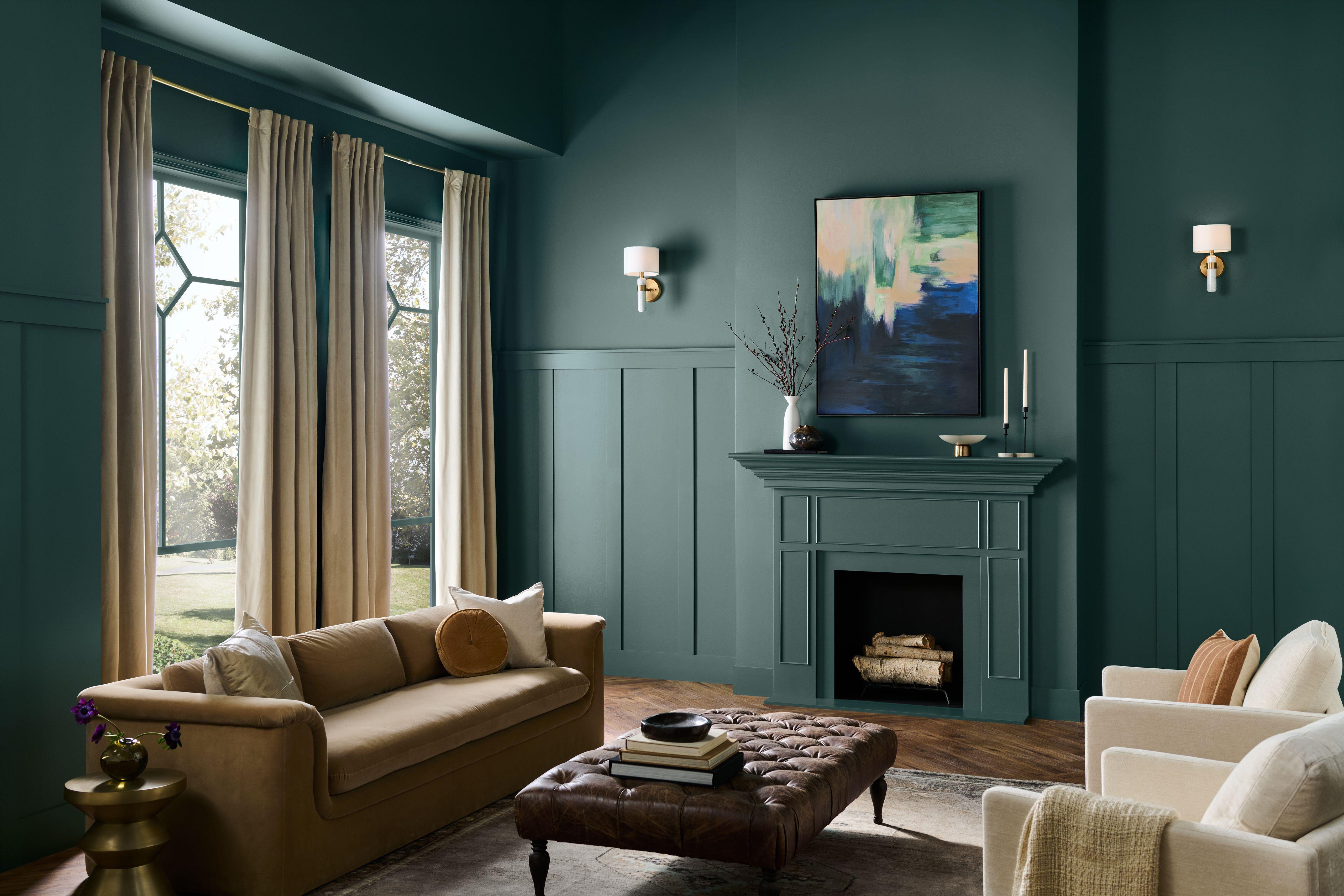
Behr
Hidden Gem by Behr
Behr was the first to officially declare its color of the year, and it's kicking off the announcement season strong. The brand describes the color, Hidden Gem, as a "smoky jade," a dimmed and complex blend of blue and green. Whether used to color-drench a powder room or serve as a subtle accent color, this hue is versatile enough for countless projects and design styles.
"You can use it on all four walls, you can use it on the ceiling, or if you just want to dip your toe in, you can use it as an asset to anchor a kitchen by painting it on the island or cabinetry, says Erika Woelfel, vice president of color and creative services at Behr. "You can paint furniture, pieces of furniture, or use it on the door."
The brand also released a 2026 Color Trends Palette to help consumers easily select other hues that pair well with Hidden Gem. Whether you lean towards eclectic, casual, traditional, or modern, Behr has a curated collection of compatible colors to fit your design style perfectly.