

Key Takeaways
- Use artwork and accessories to express your personality and give visitors a sense of who you are.
- Trim colors aren't limited to white. Create a cohesive look by using the same or similar trim colors throughout the house.
- Lighting should go beyond the utilitarian and make a statement with its style and scale.
If you haven't watched Netflix's dark dramedy Sirens, you should—as much for the decor as the intrigue. It's the story of a wealthy couple (Michaela and Peter Kell), their hired help, and a rough-edged woman from Buffalo (Devon) who shows up to rescue her sister (Simone, Michaela's personal assistant). The series takes place at the Kells' coastal compound on a fictional island that's a mashup of the Hamptons and Nantucket, with shake-shingle clad houses and plenty of hydrangeas in bloom. It's a fun watch to be sure, but don't be surprised if you find yourself pausing midstream to ogle the interiors. We certainly did. Here are five decorating lessons we learned from this peek into how one-percenters live.
Courtesy of Netflix
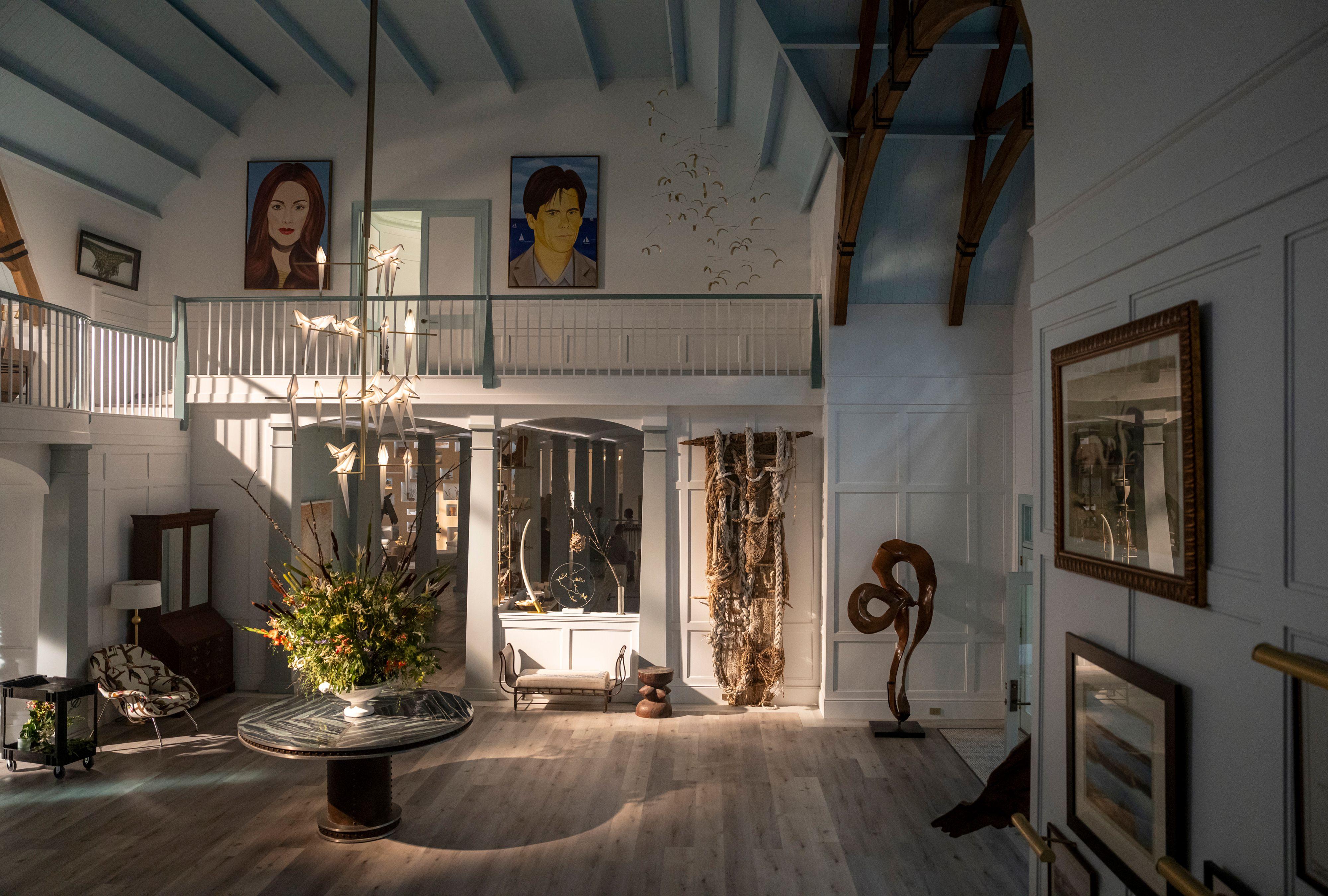
1. Theme Your Gallery Wall
Superrich diva Michaela Kell spends her time and resources rescuing birds, so the gallery wall that runs up the grand staircase in her home is all about her feathered friends. Choosing a loose theme for a gallery wall is a good way to ensure that a collection of artwork, no matter how grand or humble, looks cohesive. In this case, both the shared subject matter (birds and ocean scenes) and the shared color palette (creams, browns, and blues) make all 14 pieces hang together.
Notice how Michaela (or more likely, her fancy decorator) has hung some of the artwork very low, which leads the eye up the stairs and makes the installation more impactful, especially in this large, open space. Picture lights add another layer of interest and soft light.
Courtesy of Netflix
2. Put Your Passion on Display
The living room features one big wow: a wall of lighted niches filled with objects that look like artifacts from a natural history museum. The impact comes from the sheer size of this display, the number of items in it, and the dramatic backlighting. It's not only the focal point of the room but also expresses the personality and interests of the homeowners.
Achieve a similar effect by lining up multiple identical shelving units to create the look of built-ins, then fill them with your favorite objects. Shelving units with straight sides work best for this idea because they can be nestled tightly together. If you choose shelves with an open back, you can use them as a see-through room divider. To interesting height variation, elevate some of the objects on stacks of books, pedestals, or even footed cake plates.
Courtesy of Netflix
3. Paint Your Trim a Color
In the two-story foyer and throughout the house, millwork is painted not the expected white but a fresh shade of teal. You see it on the doors and door frames, stair railing, and beamed ceiling, among other places. (In fact, even the staff uniforms match the color scheme.) In the kitchen, the trim color switches to a pistachio green. The lesson: don't automatically default to white for millwork. Painting trim in a color with presence gives a room definition, accentuates the architecture, and adds another layer of interest—especially in a room with white or light-color walls.
Related
Courtesy of Netflix
4. Make a Statement with Lighting
With its midcentury table, Lucite chairs, and bare white walls, the Kells' dining room is quite spare and restrained—all the better to show off a chandelier with a rainbow of glass teardrops. Since a dining room is a place for gathering and celebrating, don't go boring with your light fixture. Instead, choose something that stands out because of its scale and style. Like a killer pair of earrings with a little black dress, a statement light fixture can absolutely make a room, leaving you free to keep the rest of the space simple.
Courtesy of Netflix
5. Beige Is Not Always Boring
In the guesthouse, where the Kells park Devon to keep her out of the way, the walls are a warm, light neutral color, and the trim is crisp white. This is a departure from the main house, where colorful trim is the rule. Beige gets a bad rap sometimes, but paired with white trim and white-framed artwork (supposedly a real Georgia O'Keeffe painting, yeah right!), it's a versatile, welcoming neutral that always looks polished but not cold.