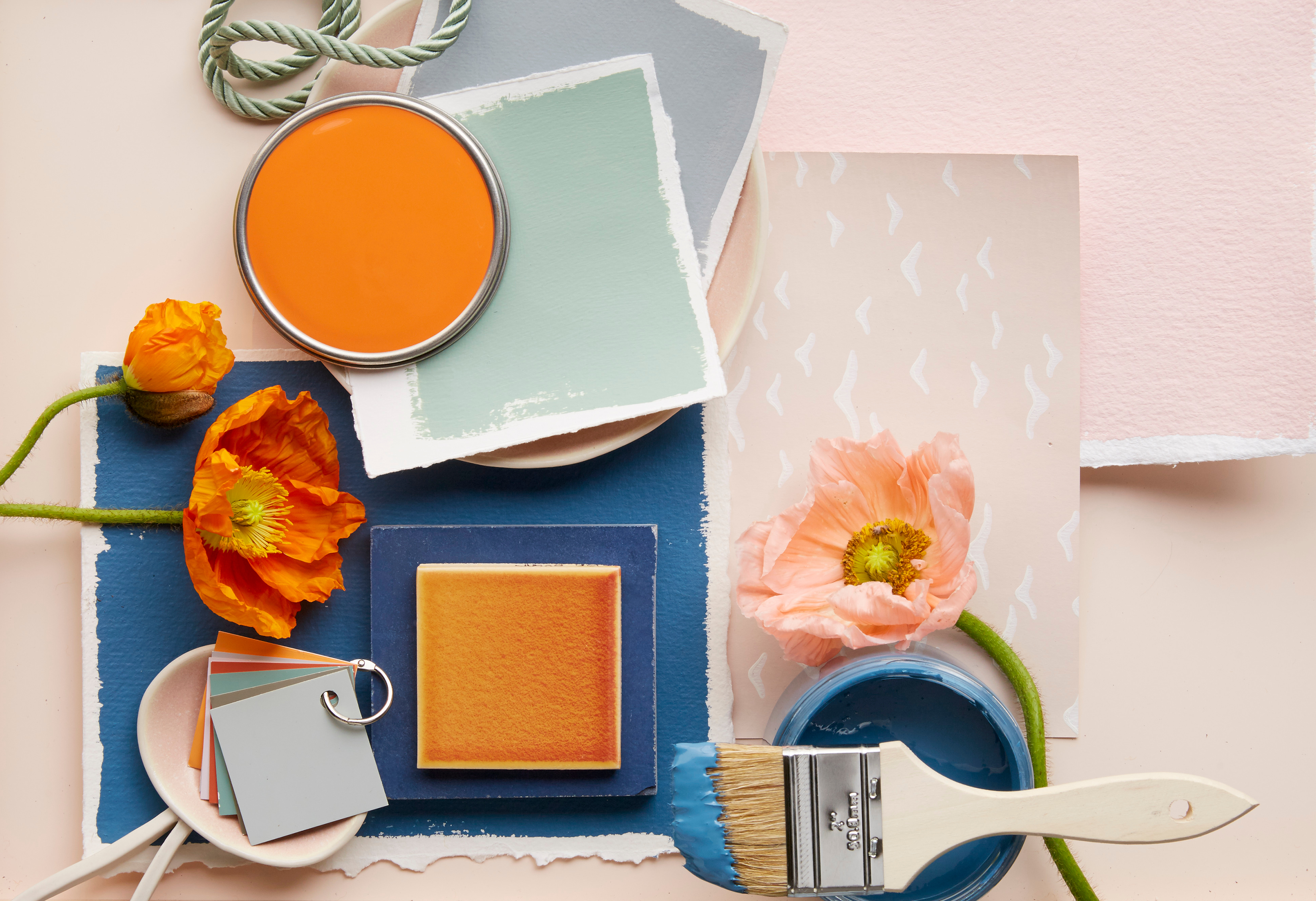
Color plays a huge role in the overall look and feel of a space. Get the color palette just right, and you have a harmonious design. But get it wrong and everything looks off. There are colors that look beautiful when used on their own, but when paired together they look dated instead of elevated. Similarly, a bold color can make a dramatic statement when layered with softer tones, but can feel aggressive next to an equally loud hue.
If you want your space to look like it was designed by a pro, here are the color pairing icks that interior designers always avoid.
1. Navy and Coral
"Navy and coral are trying too hard to read preppy, fresh, and youthful, but they end up feeling juvenile instead," says interior designer Melinda Browning of Melinda Browning Interior Design. Typically paired with stark white—and often incorporated in the form of bold stripes or a chevron pattern—the combination lacks sophistication and looks outdated instead of fun and fresh.
For a more elevated take on the duo, Browning suggests a more muted approach. "I'd rather see midnight blue paired with rust, mustard, or ochre for a mellower and more complex palette," she says.
2. Brown and Burgundy
Certain color pairings are synonymous with a particular decade—but not always in a good way. "Brown and burgundy, for example, feels heavy and outdated—more '90s basement than modern classic," says interior designer Tina Guevara of Juliette Sebastian Interiors. The designer says she gravitates toward color palettes that feel layered, elevated, and timeless, and brown and burgundy is one of a few combinations she always steers clear of.
3. Gray and Yellow
"Gray and yellow is, without a doubt, my least favorite color combination—it immediately gives me the ick," says Micaela Quinton, director of design at Copper Sky Design + Remodel. She says the color combination had its moment in the early 2010s when gray was the "it" neutral and at the height of its popularity.
"It reminds me of other design elements from that era that I do not miss, like chevron patterns and industrial furniture," Quinton adds. When it comes to neutrals, she gravitates towards warm earth tones over grays and prefers soft muted hues or deeply saturated shades.
Related
4. Red and Black
Red and black is a color pairing that Amy Peltier, creative director and CEO at Peltier Interiors, says can feel harsh, heavy, and overly dramatic in a home setting. “While both colors can be beautiful on their own when used thoughtfully, together they often lack the softness and balance we strive for in our interiors," Peltier says.
The designer explains that she wants a space to feel warm, inviting, and livable, all things that a red and black color pairing does not achieve. The two can come off as aggressive and dated when paired together. "I tend to gravitate toward palettes that feel layered and effortless, with subtle contrast rather than stark opposition," Peltier adds.
5. Purple and Orange
While interior designer Allison Garrison of Allito Spaces says she thinks you can find a way to make most colors work together, the one combination that gives her the ick is purple and orange. The designer says that the pairing ends up looking strong and jarring. However, just because two specific shades don't work together doesn't mean similar or less saturated tones of each shade can't be juxtaposed in a visually appealing way. "If you do a lavender and peach the whole feel changes and becomes workable,” Garrison says.
6. Overly Seasonal Color Combinations
There are color combinations that instantly make you think of a specific holiday or time of year. While that can make your space look extra festive during one season, it will look out of place the rest of the year. "I tend to avoid color pairings that feel overly seasonal, like red and green or black and orange—they’re so tied to holidays that it’s hard to see them any other way," says Melanie Bryant, founder of Melanie Bryant Interiors.
7. Burgundy, Gold, and Ivory
If you don't want your home to look like an outdated event hall, stay away from a trio of burgundy, gold, and ivory. "It feels too heavy, too dated, and way too traditional for the kind of spaces I like to create—It screams early 2000s banquet hall, and not in a nostalgic way," says Tehilla Bennett, owner and principal designer at Teela Bennett Designs.
When leaning into warm undertones and moodier colors, the designer recommends that you balance them with softness or texture so they don't overwhelm the space. "I avoid combos that feel overly polished or ornamental; Design should invite you in, not weigh you down," Bennett says.
8. Candy Apple Red and Lemon Yellow
"My least favorite color pairing is candy apple red with lemon yellow—when used together I can't help but think of ketchup and mustard," says Shannon Askinasi, founder and lead interior design expert at Ash & Pine. She says the highly saturated red and yellow tones are jarring to the eye and they don't look good paired together in a small piece of art, let alone an entire room.
"That does not mean I suggest avoiding red and yellow completely, especially since variations of these colors can look incredible together—I love how darker shade pairings like rust red and ochre feel very earthy, cozy, and grounding," Askinasi says.


