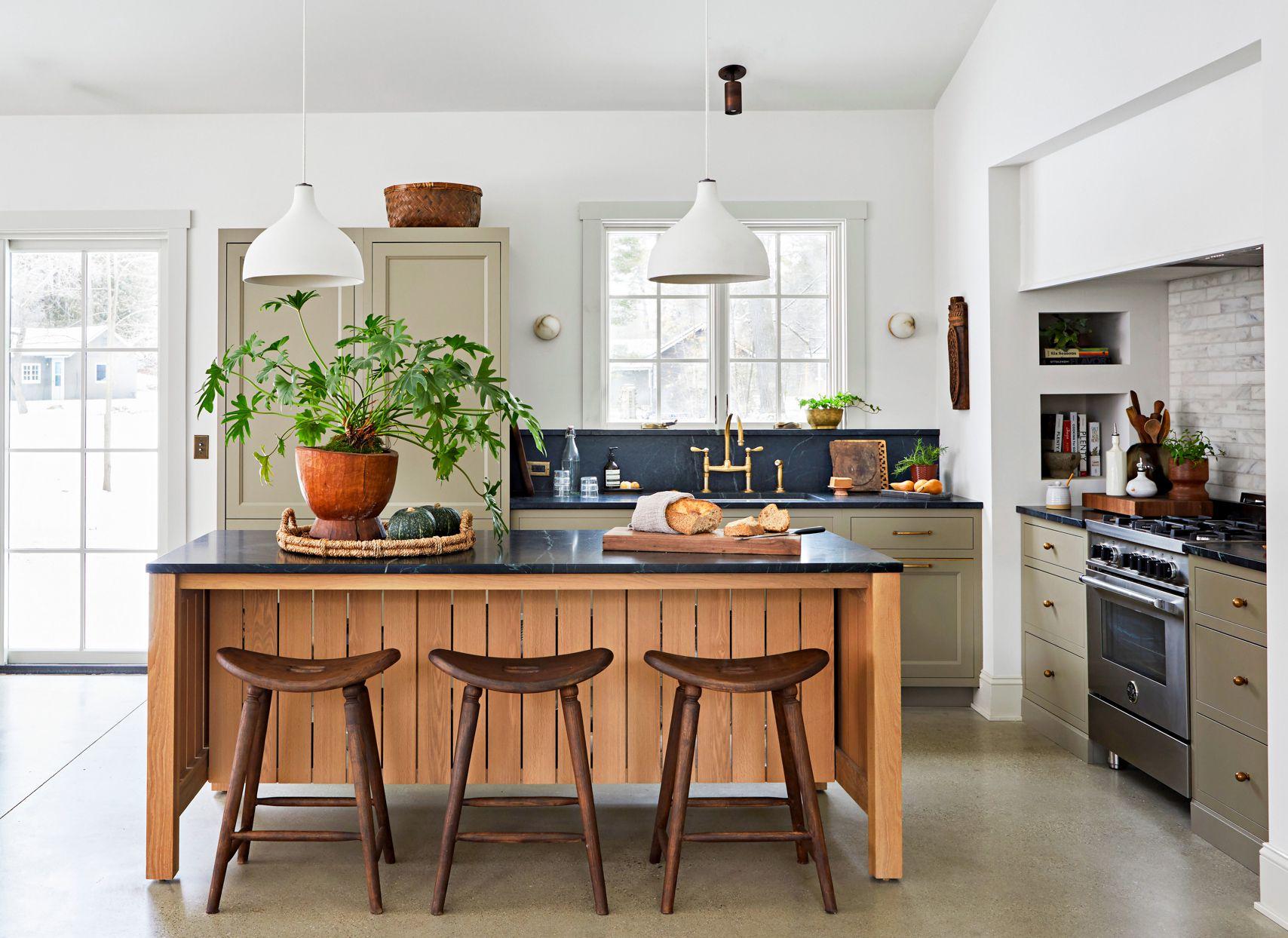
Nature-inspired colors are in. We’ve seen this play out over the past decade as crisp, all-white-everything has been traded in for natural wood tones, earthy browns, and colors pulled straight from the setting sun. While sage green might appear to be a continuation of the color evolution we’ve been following for quite some time, this one seems to have something the others don’t—staying power. “Sage is less a trend and more a return to nuance,” says Tracy Kurc, founder at Tracy Kurc Interiors. “In a world of extremes—moody black kitchens, blinding white walls—this shade offers restraint.”
Instead of boldly drenching walls in highly saturated colors that demand attention, sage green is taking a more subtle tone that is still just as striking. Here we get to know the hue you’re about to see everywhere, similarly to the decade-long trend of millennial gray. Plus, learn pro tips for how to put this shade to use in your own space without tiring of it too soon. "It’s the color equivalent of a whisper: confident, elegant, and layered,” says Kurc. “In my world, that’s the new luxury.”
- Tracy Kurc is the founder of Tracy Kurc Interiors in Chicago.
- Thea Bloch-Neal is a North Carolina-based founder and lead designer of Curated by Thea.
Get to Know the New Neutral
Putting sage green to use in your own home starts with understanding a little bit about its personality and strengths, as well as which colors it plays best with. Because sage is a neutral, it tends to lend a fresh and easy-going tone, but with a little more interest than other shades that have reigned supreme over the past decade or so.
“Sage feels like the cool older sister to millennial gray—chic, grounded, and just a little more worldly,” says Kurc. The designer considers sage a neutral, but one that is a little more intentional and confident. As with other neutrals, its grounded-in-nature quality allows it to feel versatile without being boring or dull. “It’s the kind of color that doesn’t scream for attention but lingers in your memory, like the faded cover of an old book,” Kurc says.
When determining what colors to pair with this multifaceted neutral, Thea Bloch-Neal, founder and lead designer of Curated by Thea, says sage has the benefit of skewing more timeless than trendy. However, it can at times feel like a continuation of the grays that have been having their millennial moment for quite some time; its warmth and depth set it apart from flatter grays that are falling out of favor. “It plays beautifully with both silver and gold, sits comfortably alongside neutrals, and also complements richer tones like black, navy, or maroon, which are having a moment right now,” she explains.
For Kurc, the luxurious aspect of the color also pairs well with warm tones like camel, terra-cotta, and linen, while working equally well against cool stones and charcoal. “It brings warmth to modern spaces and restraint to more traditional ones.”
Related
Tips for Using Sage Green in Your Home
Use these pro tips to incorporate sage into your existing decor without going overboard. This way, it will outlast the current trend cycle and still work in your home decades from now.
1. Play with Finishes
Think beyond a paint color, allowing sage to take a more material focus, Kurc suggests. Playing with the hue across finishes like painted wood, upholstery, plaster, and even stone can create unique plays that feel far more lasting than a “moment.” To lend shape, the designer also advises mixing in materials and elements that will add structure, like walnut, crisp white, and iron.
2. Pair with Rich Tones
Sage needs some dimension to lend a lasting feel. “Pair it with richer tones—oxblood, espresso, saddle leather—so it never feels flat or overly ‘fresh,’” says Kurc. “Think depth, not sweetness.” Try incorporating these darker accents through furniture, textiles, or even trim details to create contrast and keep the palette feeling grounded and grown-up.
3. Use It to Soften Up Your Space
“I love sage in places where you want softness without saccharine, like paneled libraries, velvet upholstery, linen drapery and throw pillows, even millwork in a satin finish,” says Kurc. “I’ve used it on ceilings when the walls needed something quieter, and it felt like the room exhaled.” The designer also enjoys pairing the nature-inspired hue with living finishes, such as unlacquered brass and natural stone, particularly in entryways. If you’re really feeling confident in your color choice, go for it by leaning on the hue for “a bit of an ethereal Oz character” in your space, she says.


