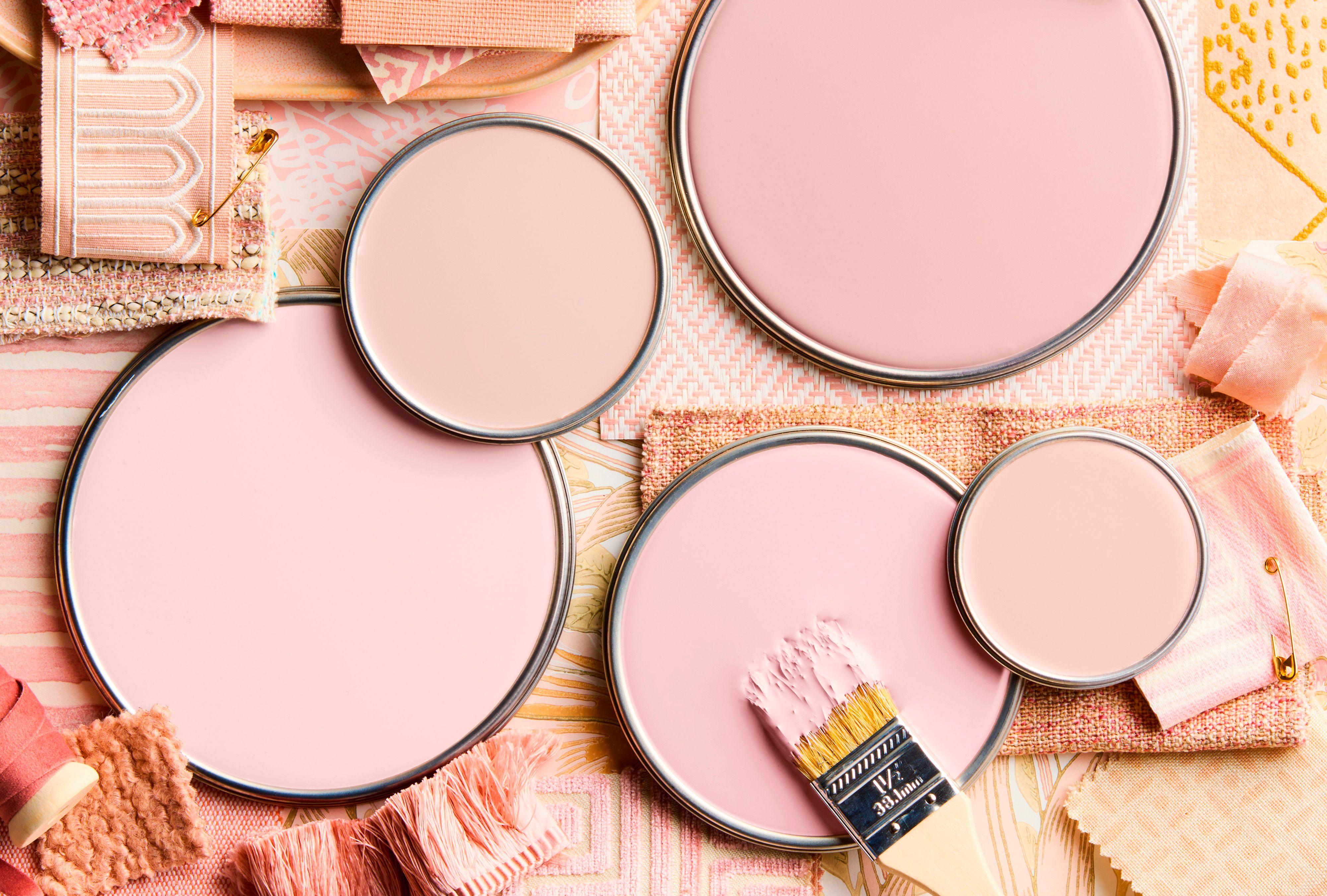
Pink is having more than a moment—it’s having a movement. Once relegated to sweet nurseries, the color has evolved into one of the most sophisticated and versatile hues, especially in dusty tones that are anything but precious. Few understand this nuance better than British designer Nicola Harding.
Known for her layered, character-rich interiors, Harding favors earthy, powdery versions that feel timeless rather than trendy. “At the softer end of the spectrum, pink tones really act like a neutral,” she says. Her genius lies in the way she pairs these shades—with mossy greens, watery blues, even red—creating rooms that feel romantic and uplifting. In Harding’s hands, pink isn’t a statement; it’s a staple.
Paul Massey / Interior Designer: Nicola Harding
Play with Contrast
“Contrasting accents are most powerful when they’re used sparingly,” says Harding. In a room next to the River Thames, she complemented pink walls (Pure & Original Skin Powder) with varying shades of blue upholstery that speak to the water outside. The strictness of the bench's striped pattern tempers any hint of saccharine in the wall color, while the turquoise pendant light adds a vibrant flash.
Rounding out the palette, chalky green trim (Paint & Paper Library Willow V) frames the room without overpowering it. "Keeping to the same level of intensity [as the walls] means the contrast is soft,” she says, noting that she chose this accent color because it is "a fresh, warm green that feels very natural."
Dean Hearne / Interior Designer: Nicola Harding
Consider Garden Cues
In a sitting room overlooking a garden, Harding painted the walls a “really dirty pink, almost into mauve” (Pure & Original Old Romance) paired with the ceiling a few shades darker (Rose Dust). "It's a brilliantly romantic shade that's part pale plum, part bruised lavender," she says.
The moody combination is enlivened with fiery fabrics. “Punchier reds and hot pinks cut through the romance,” she says. Meanwhile, dollops of green “draw the garden into the room” in a scheme that feels well-rooted, partially because pink and green complement each other in the surrounding landscape. (Just imagine a pink rose atop a green stem.)
Color combos that work well in nature—petal pinks, leafy greens, watery blues—will often work well in a room, too.
Paul Massey / Interior Designer: Nicola Harding
Go All-In on Blue Accents
If pink feels too precious, look for a warm, powdery tone and dive even deeper into pairing it with blue. “It’s a happy, fresh combination,” Harding says, noting that when pink is “relatively soft and natural in tone, it [serves] as a warm neutral,” which is a nice balance to blue’s coolness.
In this bathroom, blush pink walls (Farrow & Ball Setting Plaster) are set off by navy blue trim (Hague Blue). “It's a useful warm, deep blue that has quite a lot of green in it. An excellent bold accent," she says. The bathtub is painted a bright blue (Paint & Paper Library Blue Gum), while the gray floor continues from the hallway and grounds the palette.
Related
masterzphotois / iStock by Getty
The Time-Tested Green
In addition to the color combos she used in these spaces, Paint & Paper Sobek is a green-blue accent that Harding returns to again and again—calling it one of her all-time favorites. "I think I may have used this in every project I have ever done," she says. "It's brilliantly useful, exceedingly easy to live with, and a joy to combine with other colors." She recommends Sobek as an accent color for warm tones like soft pinks, caramel browns, and acid yellows.
For more color inspiration, Harding's book, Homing Instinct (Rizzoli, September 2025), delves deep into her passion for making spaces that feel truly like home, using color to create moods and manipulate space. “Color is my magic toolkit," she says.


