

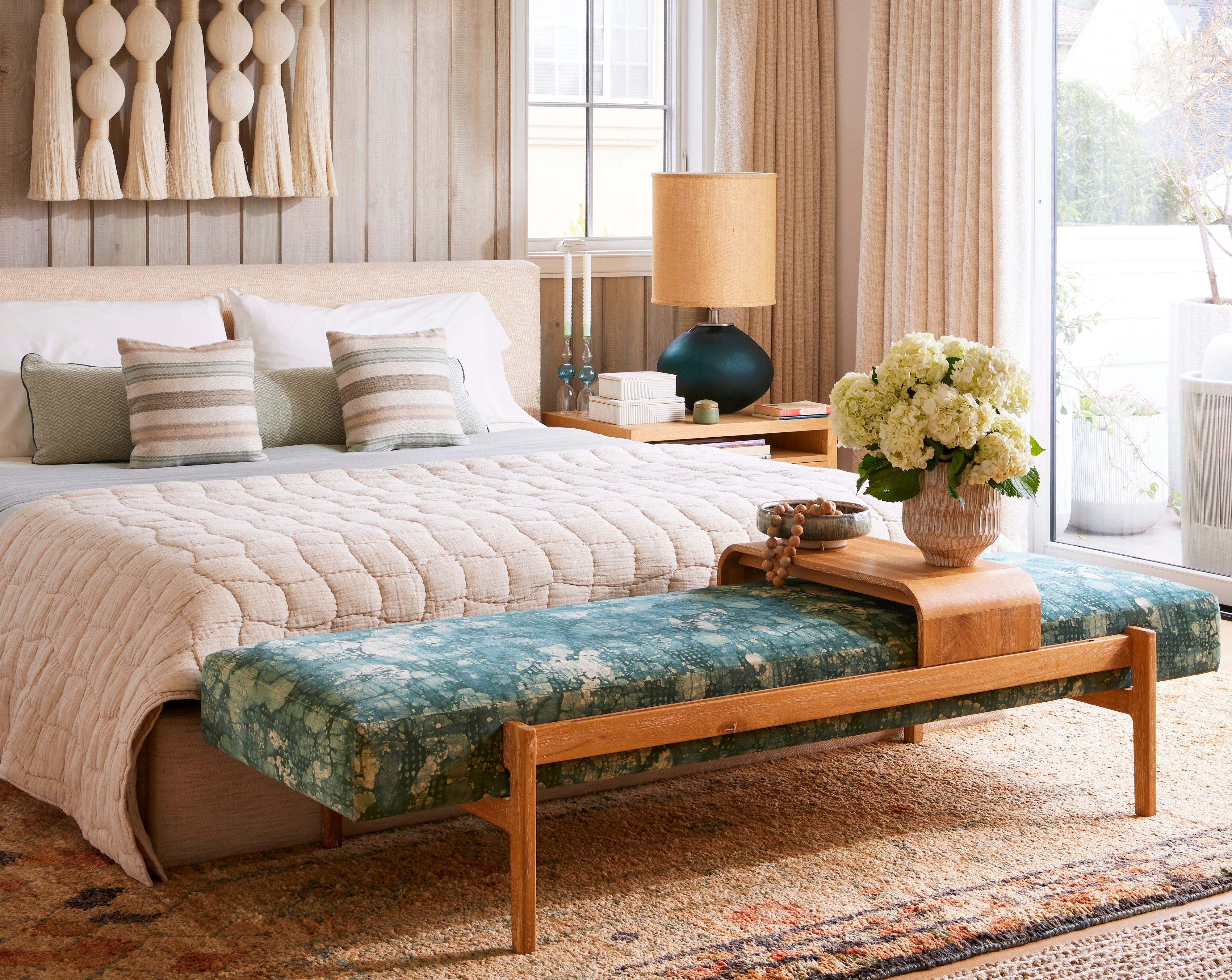
Color trends may come and go, but every once in a while, a palette captures the mood of a season so effortlessly, it feels timeless from the start. This summer, interior designers say signs point to sunwashed earth tones—a soft, muted blend of colors pulled straight from nature—as the hues of the season.
“I'm seeing a strong return to what I call sunwashed earth tones—muted clay, soft sage, warm sand, and pale stone,” says designer Shea McGee. “These colors feel grounded and nostalgic, but still fresh. I love how they bring subtle personality into a room without overpowering it.”
Sunwashed earth tones evoke the laid-back feel and breezy calm we crave when the days get longer. “Summer is all about ease and lightness, and this palette reflects that beautifully," McGee says. "These tones feel effortless and natural, like they’ve been faded by the sun.
:strip_icc():focal(1999x0:2001x2)/20220601_diy_164_preview-bc4012d9579b4cbaa580d2633d5e1cec.jpg)
:strip_icc():focal(1842x0:1844x2)/IMG_3837_preview-39de10ec77fa470f89ed6b3b85b7c089.jpg)
Edmund Barr
Fariha Nasir
How To Infuse Sunwashed Earth Tones Into Your Home
The beauty of these sun-kissed shades is their versatility—they play well with almost every design style, from coastal to modern to Scandinavian minimalism. Barry Bordelon and Jordan Slocum—the interior design duo behind The Brownstone Boys—are seeing plenty of these sun-kissed colors popping up: “Warm neutrals with a touch of pigment—soft olive, chalky peach, and weathered terracotta—are everywhere right now," Bordelon says. "These colors feel rooted and refreshing.”
“These colors pair seamlessly with organic textures like linen, rattan, light wood, and imperfect ceramics,” McGee says. “Whether your style leans coastal, Scandinavian, or modern traditional, these hues can adapt to a wide range of aesthetics because they act as a soft, inviting foundation.”
To bring these earth tones into your home, McGee suggests starting small: Look for a pale terracotta or sage linen throw or pillows in soft sand and ivory tones. A woven chair or clay vase can be a nice complement to the palette too, she says.
“I especially love these tones in bedrooms, living spaces, and entryways—anywhere you want to create a welcoming or restorative feel,” McGee says. “They also work beautifully in kitchens when paired with white oak cabinetry or honed stone countertops. Think softness and warmth without being too precious.”
Whether you're doing a full summer refresh or simply swapping out a few accessories, sunwashed earth tones offer a palette that feels as soothing as it is on-trend. “Ultimately, these tones give us space to breathe,” says McGee. “They help create homes that feel lived-in, layered, and relaxed—exactly what summer is all about.”
James Nathan Schroder
Another Designer-Loved Scheme: Soft Mineral Tones
Interior designer Nina Takesh is seeing a similarly soft, nature-esque palette take center stage. “I see soft mineral tones—chalky celadon, sandstone, and pale ecru—emerging as key players this summer,” she says. “These tones are appearing in Paris and Milan showrooms, and I’ve been incorporating them into architectural finishes and custom upholstery to bring a sense of serenity and refinement.”
Takesh recommends pairing these hues with materials that enhance their tactile luxury. “I love marrying these hues with a mix of antique and contemporary—think vintage travertine coffee tables, brushed brass accents, and sculptural lighting,” she says. “The softness of the palette lets statement pieces and bespoke detailing truly shine without competing.”
Her favorite way to introduce the palette? “Begin with your foundation—consider repainting walls in a mineral white or layering in an area rug with a sun-faded pattern,” she says. “Accessories in alabaster, handmade glass, or patinaed metal can bring depth while still maintaining that soft, atmospheric feel.”
Joyelle West Photography
Other Color Trends Designers Are Loving This Summer
Sunwashed earth tones and soft mineral hues aren't the only colors trending this summer. Designers are also seeing a lot of these palettes throughout homes and decor.
- Sunwashed Pastels: Sticking with the sunwashed theme, interior designer and HomeGoods Featured Finder, Jenny Reimold is seeing a lot of sunwashed pastels like muted peach, misty blue, and butter yellow taking the lead this summer.
- Bolder Accents: Reimold also has seen richer hues like indigo and terracotta being used as accents to add depth and contrast.
- Berry Tones: Home style expert Ursula Carmona is seeing plenty of berry tones, which can add a perfect pop of color to an entertaining spread this summer.