

Your favorite red-and-gray flannel is having an interior design moment—its cozy color palette is a trending decorator favorite and a background costar of the final Downton Abbey film: The Grand Finale (cue the lavish red room and glistening silver accessories).
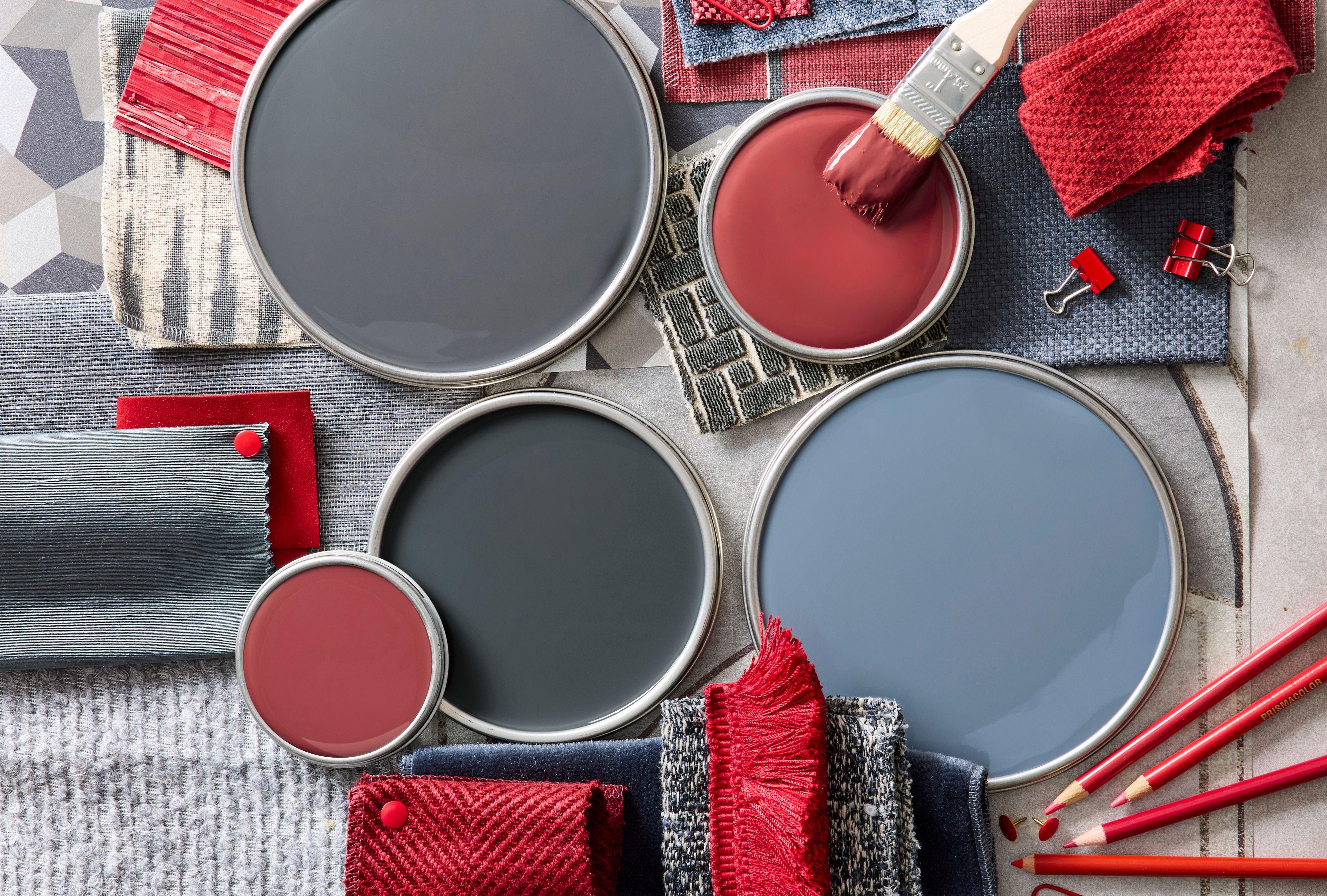
At home, dynamic red brings energy and excitement to a space, while gray feels cool, calm, and soothing. When the two are put together, the synergy is strong. Read on to learn how four designers balance the tone and saturation of each to make a room feel bold and sophisticated or relaxed and comforting.
Lucas Allen / Interior Designer: Turner Pocock
1. All in on Midtones
The mood in this family room is “cozy, slouchy, inviting,” says designer Emma Pocock of Turner Pocock. That feeling begins with walls and furnishings in quiet tones of blue-gray that blend or contrast depending on the light—it reflects differently off the upholstery, wallpaper, and painted surfaces (Paint & Paper Library Squid Ink on wainscoting and trim).
Raspberry reds and warm pinks on throws, pillows, a lampshade, and rug all “lend depth to the scheme with layers of patterns,” Pocock says, noting that the room’s success lies in balancing the dark backdrop with bursts of vibrancy. “Rooms like this are most effective when they are naturally dark," she adds. Try a north-facing room.
Stephen Kent Johnson / Interior Designer: Ryan Lawson
2. Dark and Moody Hues
A saturated color palette works best when its hues are similar in richness and tone. “Gray is theoretically a neutral color, but it rarely is actually neutral,” says designer Ryan Lawson. He suggests asking yourself: “Does the gray lean cool and blue? Or is it warm and brown?” Then, he notes, remember that reds can also have warmer orange or cooler purple undertones.
Create a Cocoon
For Lawson, the pairing of deep red and gray (walls custom-painted in Destin by Ressource) is dynamic yet restorative, making it an ideal environment for a restful night’s sleep. Rounding out the palette in his own bedroom: a brown bed cover and wood table ground the space; orange in the artwork and rug activate it while adding warmth. “If you choose a strong paint color or a bold fabric to start, the rest of the parts of the room need to hold their own,” he says. A paper lantern adds visual levity.
James Merrell / Interior Designer: Penny Morrison Ltd
Find Balance
The key to this rich dining room is keeping colors in the same tonal range, with the dining set and wall color (Paint & Paper Library Paris Rooftops) equally full-bodied. “If the red was any brighter or the gray more of a true black, the scheme would be jarring,” says Shauna Dennison Taylor, creative director at Penny Morrison Ltd. In the same vein, the sleek lacquer of the table and chairs is offset by the soft matte paint finish and a textured rug.
Related
Alex James / Interior Designer: Turner Pocock
3. Light and Airy Atmosphere
“We have a mantra that you can never make a dark room light or a light room dark. You have to embrace the vibes and take your decorating lead from it,” Pocock says. Luckily, red and gray work just as well in spaces with a brighter air, creating a look that is spirited yet restful and oozing with hygge—the Danish approach to cozy comfort.
Keep It Simple
Red is a fitting accent hue for this mountain retreat, where Pocock kept to a tight palette inspired by the Swiss flag. “When creating a Scandinavian vibe, you have to stick to your guns and keep everything neutral with just a couple pops of color,” she explains. Furnishings in classic suiting gray speak to the mountain locale. “It hangs well with the winter snowy look.”
Milo Brown / Interior Designer: Lonika Chande
Add Rustic Touches
A client’s favorite fiery red-orange was the starting point for designer Lonika Chande, who used it on the kitchen island and dining chair frames, then softened the hue with rush seats, a fluted wood dining table, and off-white walls. “We focused on warmer earthy tones and included natural finishes and texture to bridge the hues,” Chande says. A weathered sideboard and rug with shades of charcoal anchor the space. “This scheme works best when it’s not too polished,” she says.