

The 2025 Real Simple Home might be a real-life deluxe apartment in the sky—literally a duplex penthouse on the 23rd floor of a swanky Manhattan high-rise—but it, along with a two-bedroom annex, is bursting with ideas for transforming a white box, new construction into a comfortable, layered home filled with personality.
For its eighth annual show house, Real Simple tapped an all-star cast of designers, content creators, and tastemakers who infused each room with character that you can easily translate to your own home, no matter where you live. Here are seven clever ways they made this luxury new-build feel like a sanctuary in the city—from color cues and architectural details to DIY touches and clever furniture choices.
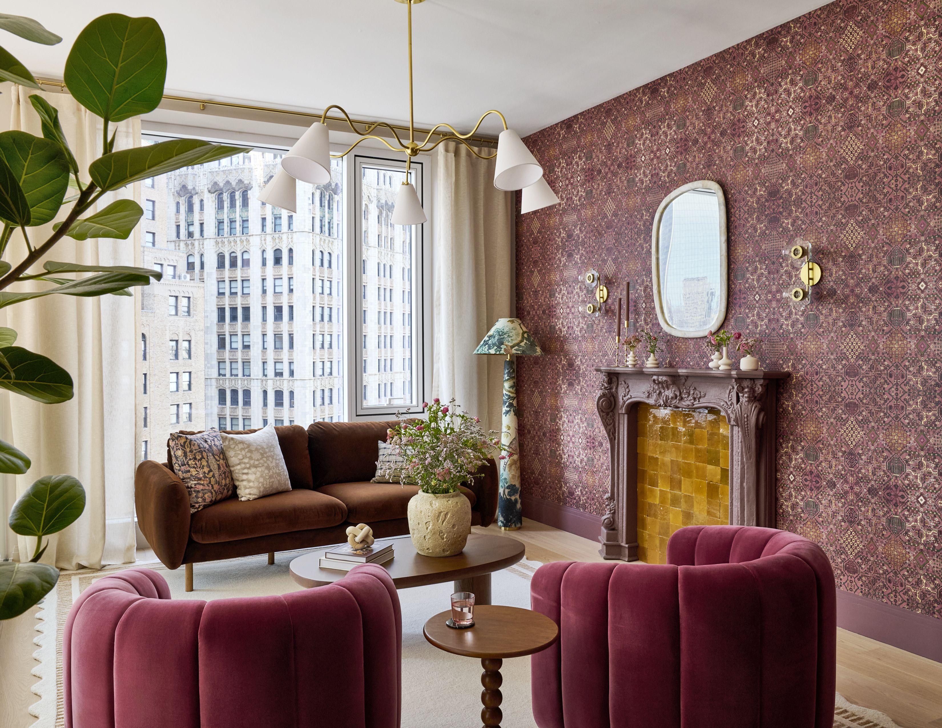
1. Warm It Up
A loft space with floor-to-ceiling windows and bare white walls was bursting with natural light, which could be a good thing, but Toronto-based design expert Alexandra Gater wanted to create a loungy vibe. “My solution was to envelop the space in a rich, moody wallpaper with warm tones woven throughout,” she says.
That meant lining the walls with House of Hackney’s Moroccan carpet-style wallpaper and adding a faux fireplace painted with Valspar Berry Brandy to complement the pattern. Zellige tiles lining the hearth add texture and flicker in the light. It goes to show that you can take “a very modern, cookie-cutter space and still turn it into a cozy, whimsical haven,” says Gater.
Kelly Marshall | Prop Styling: Sophia Pappas/REAL SIMPLE | Interior Designer: Drew Michael Scott
2. Layer in Vintage Furniture
Drew Michael Scott, content creator, designer, and founder of Lone Fox, has a keen eye for vintage furniture, and it shows in how warm and inviting this living room feels. The key is to mix pieces from different eras and regions—a French sideboard across from Danish chairs, for example—and don’t be afraid to mix wood tones. “Often, people move into a new build like this and assume they need to go super modern with their furniture. While that look can be amazing, more often it ends up feeling cold and unlivable. Your starting point will influence the final outcome, but it doesn’t have to pigeonhole you,” he says.
DIY flourishes, like adding fringe to the bottom of the curtains, also up the coziness factor. “A perfect fix if your curtains are a little short, or just a way to make them feel extra luxe,” he says. To keep the room bright and inviting without veering into stark, Scott painted the walls and ceiling a sandy tone (Valspar Quill) that reads paler in the daylight. “Most people would probably call it white, but it has a much warmer feel. It’s almost like if white and butter yellow had a baby,” he says.
Kelly Marshall | Prop Styling: Sophia Pappas/REAL SIMPLE | Interior Designer: Mandy Cheng
3. Create a Focal Point
To rein in a small room with high ceilings and sweeping views, Los Angeles-based interior designer Mandy Cheng channeled traditional wall paneling with a modern twist. “I knew I needed to add layers and textures to make the room feel cozier,” she says. “I wanted to add millwork, wainscoting, molding, and trim everywhere [but] I thought about how to create it using non-custom pieces.”
She achieved that effect on a budget by gathering a group of framed mirrors with wood bead trim and installing them from floor to ceiling in a checkerboard pattern: half as-is and the other half with a wallpaper backing where the mirror had been popped out. “Utilizing the full wall height is crucial in making a smaller room with tall ceilings feel more approachable,” she notes. The ceiling and surrounding walls are painted Valspar Sweet Clover—a soft green that pulls out the verdant hues in the wallpaper pattern (Nathan Turner's Cowboy Toile).
Kelly Marshall | Prop Styling: Sophia Pappas/REAL SIMPLE | Interior Designer: Mallory Fletcher
4. Add Architectural Detail
Reserve Home content creator Mallory Fletcher is well-known for the French flea market-style decor that infuses her Brooklyn apartment—and for her DIY chops. That combo was on full display when she turned her sights on the clean lines of this modern condo. To infuse a bare home office in the annex with retro Parisian flair, she installed crown molding and chair rails, then converted IKEA's Besta cabinets into a faux built-in. "A favorite IKEA hack of mine, which involved more moldings, go figure!" she says. An Old World shade of pink (Valspar Farm Fresh Eggs) gives the room a warm glow, no matter how gray the day might be.
Related
Kelly Marshall | Prop Styling: Sophia Pappas/REAL SIMPLE | Interior Designer: Valeria Jacobs
5. Evoke Nostalgia
“This room was a challenge for me—I’ve never designed a space in a modern building before. It was literally a white box (with a stunning view), so we had to get creative,” says Rebecca and Genevieve creator Valeria Jacobs of the annex’s bedroom. She looked to those views to devise a palette that “leaned into earthy, calming tones” inspired by the surrounding buildings and the city’s soft golden light at dusk.
From there, Jacobs layered in pieces with a nod to her signature cottage style, including a botanical grasscloth wallpaper from Amber Interiors that lent texture to the bare walls. “Molding and wallpaper go a long way,” she says, noting that she also installed a strip of molding seven inches below the ceiling so it would mimic period crown molding. “I wanted something simple that would add character without being expensive,” she says. Valspar Ivory Essence caps the room in a soft tone of antique white.
Kelly Marshall | Prop Styling: Sophia Pappas/REAL SIMPLE | Interior Designer: Alvin Wayne
6. Create a Cocoon
New York-based interior designer Alvin Wayne used color, texture, and pattern to transform the bedroom from a bright and airy blank canvas into a soothing, enveloping retreat. “My starting point is always the feeling I want the space to evoke,” he says. “Here, I envisioned something serene yet layered, so I grounded the design in a soft palette and then built dimension through textiles, finishes, and a few bold accents.”
Rather than paint, Wayne used Valspar Terra Venetian plaster on the walls in a rich, earthy hue. “It instantly transformed the room—bringing depth, warmth, and character where there was none,” he says.
Kelly Marshall | Prop Styling: Sophia Pappas/REAL SIMPLE | Interior Designer: Noz Nozawa
7. Take It Outside
“I hope readers with even the teeniest of outdoor spaces feel like they can bring the same kind of warmth and vivacity to the design of their yards, patios, and balconies that they love about their indoor environments,” says San Francisco-based designer Noz Nozawa, who turned the apartment's terrace into an outdoor living room.
Nozawa approached the decor with the goal of softening the architecture's hard lines and surfaces, while channeling the color palette of the building materials. “I prioritized furniture with curves and radiused corners, warm woods, warm colors, and outdoor rugs and blanket-towels that feel like they could belong indoors just as easily,” she says. For extra softness and a bit of greenery in the concrete jungle, she lined the terrace's perimeter with planters featuring a mix of grasses and shrubs.