

Google has a new look for the first time in a decade.
Almost exactly 10 years after introducing the four-color "G" logo, the company announced in a blog post today that the logo is getting updated across the entire brand. The new logo is basically the same, except the colors smoothly transition into each other with gradients instead of having hard stops between them. According to Google, this new logo will come to its bevy of apps and services "in the coming months."

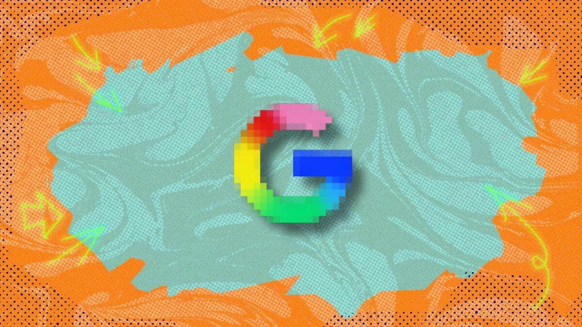
Left: The old logo... Credit: Google
Right: ...the new logo, in all its glory! Credit: Google
This is obviously not a huge change, but Google's stated reasoning for it is worth a read, at any rate.
Mashable Light Speed
"The new 'Google G' now represents all of Google — both our brand and the company — and visually reflects our evolution in the AI era," Google's blog post said. "While staying true to Google’s iconic four colors, the brighter hues and gradient design symbolize the surge of AI-driven innovation and creative energy across our products and technology."
Well, alright then. Gradients equal AI innovation now, apparently. Good to know.